We all find our comfort zones, but every once in a while, it’s fun to try something new. For me, something new is, in fact, something quite old: a formulation of colored pastels that includes oil. Remember “Cray-Pas” from elementary school art class? I’m playing with the grown-up version, originally designed by Henri Sennelier, in Paris, in response to his friend Pablo Picasso’s request for oil paint that could be applied in stick form. Nearly seventy years later, Pastels à L’Huile, or Oil Pastels, continue to be a part of art supplier Sennelier’s product line. Since I enjoy working with pastels, I thought I’d try a boxed assortment of 24 oil pastels and consider the possibilities.
Unlike most media, oil pastels can be used to draw, paint or otherwise color on a remarkable range of surfaces including (but not limited to) paper, canvas, cardboard, wood, metal, plastic, or glass. And like watercolor pencils and watercolor sticks, oil pastels can provide the color in a mix with a solvent–essentially providing a very portable set of oil paints with minimalistic clean-up. They look, feel, and behave a bit like lipstick. Have a look at the video and you’ll see the possibilities.
The best way to get a sense of oil pastels is to buy a few a handful (visit Rochester Art Supply, or Dakota Pastels). For a basic introduction to the art and craft, I picked up a used copy of Oil Pastel for the Serious Beginner by John Elliot (I like other titles in this series, especially the ones about watercolor and pastels). You might also visit a few sites, like Eric Green’s Beginner’s Guide to Oil Pastels, or, even better, Explore Oil Pastels with Robert Sloan which is, easily, the best website about oil pastels in the world.
Sloan’s work with oil pastels is excellent. Below, two images from his website gallery, both already sold, but several equally handsome pieces are available.


Of course, there is nothing like getting your hands dirty. Sennelier’s set of 24 assorted oil pastels is just about right for the start–a spectrum mostly comprised of mid-tones, a bit lacking in lights and darks.
At the most basic level, you can use Sennelier oil pastels as you would crayons–an adult version of crayons, carefully isolating each stroke in the same way that some children keep their peas far away from anything else on the dinner plate. For graphic work, that’s a reasonable approach, but you lose out on some of the magical quality of oil pastels. These little guys (they really are fairly little) blend colors just beautifully–but you must use a very light touch to get the best possible effect. Once you start filling the surface’s texture with the pasty output, mixing and refinement becomes challenging.
I found a helpful way to practice, and refine my technique: I use “the wire side” (highly textured) of Canson’s reasonably inexpensive Mi-Teintes paper, and when I start filling the small pores in the paper with pigment, I have pressed too hard.
Another helpful note: the stickiness requires a special kind of attention. When blending, the stick picks up the blending color, so it’s not unusual to see a yellow oil stick with a film of, say, bright red or green. With dry pastels, you can usually wipe this off easily. With oil pastels, you must be vigilant, always keeping a lint-free bit of cloth nearby so you can wipe stray colors off the sticks. At first, this is annoying, but I got used to it.
Each stick is supplied in a paper wrapper–very useful to keep your hands clean, because the sticks become sticky and softish. But they do break inside the wrappers, and there’s not much you can do about that (then again, you can buy a larger, thicker version of Sennelier Oil Pastels, which may be preferable for some artists).
On and off for a year, I’ve been playing with these oil pastels. At first, I found them to be exceedingly difficult to control, an emotional return to my childhood frustration with Cray-Pas–just too thick, too rich, too everything for my comfort zone. In time, I came to understand the value of a lighter touch. Now, I find myself happy and content, mostly sketching and blending colors, every-so-softly, finding that I can experiment with color mixes with an immediacy and vivacity that’s not readily available in other media. It’s just plain fun to sketch with oil pastels, and if drift into nonrepresentational mode, so much the better. It’s tough for me to get a clear representation of a real life object with these sticks, but that’s why I use other media. It’s tough for me to enjoy the gentle abstraction that I find easy with oil pastels when I try to do the same with other media.
I tried a blending stick–Sennelier Oil Pastel # 221–and at first, I disliked rubbing what seemed like a white wax candle on my work. Then, I tried again, several more times, and I began to appreciate the way the blending stick pushes the vivid colors together. I can do the same with my finger with dry pastels, but the effect is different here (and, besides, finger blending with oil pastels, at least with my fingers, makes an awful mess).
All of which makes me admire the sample work from Robert Sloan even more. I am not yet at a point where I can exert real control over the strokes–and when I see the precision that he achieved on his big cat drawing, I feel good because I know that it is possible for a human being to exert that kind of control on what are, so far, tools that I have not yet mastered.
That’s the fun, of course. If you already know how to do something, maybe there’s not much opportunity to learn. Right now, I am just a beginner, and I celebrate the frustration, the sheer joy in knowing that I can and will learn, and develop at least a modest form of mastery over what amounts to a sophisticated version of crayons (in the best professional sense of the term).
Samples of my work? Perhaps in a few years. For now, I’m happy as a beginning student in a new medium. No need to embarrass myself. I’m learning a lot, and I’m reporting my progress. And doing my best to spread the knowledge I’m gaining along the way.
Another thing I’ve learned about myself (though I suppose this is common to others, too): I am always drawn to collections of bright colors across the spectrum, but these sets are not always the best choice for learning about a new medium. Lights and darks make all the difference, so I will soon be enhancing my basic spectrum set. For those with a bit of money and a sense of adventure, two other sets are probably a better place to begin than the 24 Assorted selection–the wood box set of 50 “Original Picasso Colors” (on sale at Fine Art Store for $117), or, for $50-60 more, the set of 72 colors in a nice cardboard box (Fine Art Store: $173). Both include a useful mix of light, mid and dark tones–of course, the 72 set is preferable. Or, you can just buy a handful of whatever oil pastels you’d like–Sennelier products are widely distributed throughout the world. Just visit a good art supply store.
Sennelier is not the only company offering portable oil sticks–Holbein sells a very wide range of colors (224 to Sennelier’s 120), and Cretacolor sells a similar product under the name AquaStics, which are water soluble. Winsor & Newton sells much larger and thicker Oil Bars–with a different formulation that categorizes their product as more closely related to oil paints in solid form, less aligned with oil pastels (“Don’t mistake them for oil pastels, though – Oilbars are made to a special formulation of linseed or safflower oil and wax.”–from the company’s website). Sennelier also makes and sells oil sticks.


 A violin is not invented or perfected in a moment. It must be played, enjoyed, improved, adjusted, and sometimes, rebuilt, often over years, decades or centuries. In fact, many high quality violins are antiques that been rebuilt and rebuilt so often that little of their original material remains. Still, this is the way the culture has evolved. And that culture is not especially welcoming to an inventor with a better mousetrap. That’s why so many of Hutchins’ instruments ended up in musical instrument museums, and so few have been heard on stage in performance. Happily, there is the
 I started by creating as much open desk space as possible. IKEA to the rescue: a pair of white Limmnon 79-inch long, 23 inch deep desktops, each costing $45. One for each long wall, plus an ALEX 9-drawer white cabinet for storage, and a variety of old storage cubes recaptured from the basement and from other rooms. So far, I have not found the perfect roll-around task chair–a future project. The bookcases remained in place–the white Billy shelf units that are both inexpensive and look great.
 The flood lights were wonderful for work at the easel, but far too bright for every day room lighting, and totally useless for watercolor and drawing at the desk, I researched task lights–somewhat unfamiliar to me–and found a very cool company called
  The new


 What else? Plenty of time to organize too many art supplies. The need for pleasant music (mission accomplished thanks to some forgotten stereo equipment in the basement). And–big discovery, however obvious it may seem–once a painting is complete, it needs to live somewhere. When I kept all of the finished work in a box flat box, this was not a problem. Now, I felt the need to display recent work, if for no reason except my own assessments. Once again, IKEA provided a solution: 45-inch long Mosslandia “picture ledges” (just reduced: now just $9.99– and I hope they’re not being discontinued).
 We started with one of the past century’s best–Herbert von Karajan conducting the Berlin Philharmonic in 1961-2 for Deutsche Grammophon. I had just picked up a $4 LP, in very good shape, from
 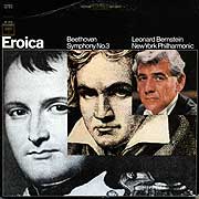 Next up: Leonard Bernstein from the same. Era. This was my LP, purchased decades ago, kept in it boxed set, played maybe ten times. This was a master work from Columbia Records at the label’s prime. The performance is ambitious, engaging, flowing–but the sound of the horns and the strings was compressed, very limited in highs and lows. We wanted to hear the depths of Beethoven explored by Bernstein in his prime–but the recording let us down.
 Before going modern, we decided to go for Toscanini and the NBC Symphony Orchestra, first on LP and then on CD, recorded in 1949–before stereo recording was available. This was state-of-the-art at the time, but the dynamic range was so limited on these recordings, they did not stand up to modern listening. Historical interest only.
 I had high hopes for my treasured 1995 CD set from Colin Davis and the Staastkapelle Dresden. Sure enough the CD really delivered–a full range of highs, lows and everything in-between. Wonderful placement of instruments. Lots of clarity, distinct individual violins and basses, just the right horn sounds. I was excited–but somehow, the listening experience was a few marks less than thrilling. After Karajan and Bernstein, the passion felt a little lacking. A fine performance is not the same as a thrilling performance, and when I’m listening to Beethoven’s Eroica, I want to be thrilled. But the sound was more satisfying here than it was on any of the LPs.
 Now here’s my last one. It’s a digital remaster from 1963, a CD box that I didn’t even know I owned. It’s the Gewandhausorchester Leipzig led by


 The youthful exuberance is gone, the social awareness is increasing, the production is slicker by 1969’s “Stand” — “you’ve been sitting much too long—there’s a permanent crease in your right and wrong!” – “there’s a midget standing tall, and a giant beside him about to fall!” It feels a bit dated, a golden oldie, a solid memory but the controlled chaos and the crazy audio production is a thing of the past. From the same album (called Stand), there’s “Sing a Simple Song” and “Everyday People”— probably the group’s high water mark— and both of those songs bind the no-holds-barred past with the glossier, socially consciousness future. The same album’s “Don’t Call Me Nigger, Whitey” (same lyric, “Don’t call me whitey, nigger”) is a sincere push toward revolution.
 Since overtures “have become a rarity today,” the opening number carries the weight. Originally, A Funny Thing Happened on the Way to the Forum began with “a sweet little soft shoe about how romance tends to drive people nuts” but that misled the audience because the show was not about romance or charm, but instead, a boisterous vaudevillian take on three Roman comedies. Critics and audiences don’t enjoy mixed messages, so the reviews were lousy and the audiences stayed away. The creative team—a top-notch group that included Larry Gelbart, Stephen Sondheim, Hal Prince, George Abbott, and Burt Shevelove—didn’t know what to do. They asked director Jerome Robbins what he thought. He asked Sondheim (music, lyrics) to write something “neutral… Just write a baggy pants number and let me stage it.” Viertel: “He didn’t want anything brainy or wisecracking, but he did want to tell the audience exactly what it was in for: lowbrow slapstick carried out by iconic character types like the randy old man, the idiot lovers, the battle-axe mother, the wiley slave and other familiar folks. Sondheim wrote “Comedy Tonight” as a typically bouncy opening number, but he couldn’t resist his clever muse, and so, the “neutral” number’s lyrics go like this:
 Another simulates the movement of a train pulling into River City, Iowa a century ago—serving to introduce the flimflam man named Professor Harold Hill—“Cash for the merchandise, cash for the button hooks, cash for the cotton goods, cash for the hard goods…look, whataytalk, whataytalk, whataytalk, whataytalk?…”to set the stage for The Music Man. Similarly Cabaret begins with the multi-lingual “Wilkommen” and Fiddler on the Roof begins with “Tradition.”
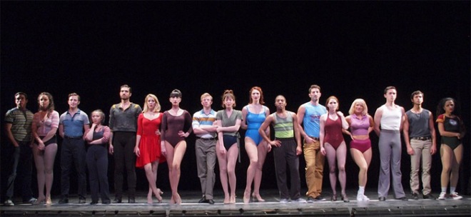
 In Annie, the I Want song is “Maybe”– the orphan dreams of her parents. In Gypsy, the “I Want” song is “Some People,” and in “West Side Story,” it’s “Something’s Comin’” In Hamilton, it’s “My Shot.” It’s “Wouldn’t It Be Loverly” in My Fair Lady and “Somewhere That’s Green” in Little Shop of Horrors. Note the consistency of a place far away as a device to express desire—“ Part of Your World” in The Little Mermaid follows the same pattern.
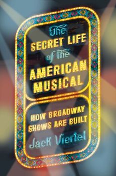 Gee, this is fun. Suddenly, every musical I’ve ever seen makes more sense than ever! I could go on about “The Candy Dish,” “The 11 O’Clock Number” and the construction of the ending, but that would make the whole blog article too long. Pace matters.
 The turnaround story begins, as it ought to begin, with a pitch from a creative professional to a producer. The two remarkable people in this particular scene are Public Theater producer Joseph Papp and choreographer-director Michael Bennett. Reidel: “Bennett arrived at Papp’s office at the Public Theater carrying a bulky Sony reel-to-reel recorder and several reels of tape. He had nearly twenty-four hours of interviews with Broadway dancers. He thought there might be a show somewhere in those hours and hours of tape. He played some of them for Papp. After to listening to the recordings for forty-five minutes, Papp said, ‘OK, let’s do it.”