Small Atlases Make Intriguing Gifts

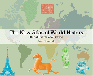
Sometimes, it’s difficult to understand an idea without seeing a picture. I suppose that’s one of the reasons why I like the idea–if not always the execution–of infographics.  Give me a good map with abundant legend, little boxes with big information, arrows to guide me, and I’m more like to understand a complicated idea. The book publisher Dorling-Kindersley, also known DK, has developed a brilliant style based upon the visual display of encyclopedia information (you know their Eyewitness Travel Guides, for example).

Given sufficient free time, I’ll wonder about just about anything. One thing thing I’ve always wondered about is how mankind managed to populate every corner of the earth. Think about it–a small population in central east Africa with extremely limited resources, no meaningful transportation, little protection from the elements or from one another, somehow ended up in Siberia, South America, even Australia. How? Well, mostly, they walked. (Along the way, they struggled to invent the needle so that they could sew animal skins together, astonishing tech in their time).

You can learn a lot about the world by studying migration maps. For example, just about everybody knows that a large portion of the U.S.’s black population came from Africa. Now Africa’s a big place. Where did they come from, exactly? Yeah, well, I had no idea until I checked a map in People on the Move: An Atlas of Migration by Russell King. There were two main “collection points”–one was Luanda, still the largest city in Angola (many of those slaves were controlled by Portuguese interests, so they ended up either in Brazil or the U.S.). Slaves leaving from Accra and El Mina (or, Elmina) mostly traveled to Brazil, Virginia or Louisiana. Some African slaves ended up in Portugal, too. The British, French and Dutch colonial slaves more often traveled to the Caribbean Islands.And that’s just part of the story: lots of African slaves were sent along Arab trade routes and up into Turkey–a much earlier system of human trade based upon ancient tradition.

MIGRATION_GreatSo that’s one migration. There’s another 13.5 million people moving during the period 1815-1915. Those people are moving, mostly, from Europe to America. Lots from Ireland, England, Scandinavia, and later, Spain, Italy, and eastern Europe–the peopling of America.

Migration is still a robust human endeavor. The oil boom in the Persian Gulf has been a magnet for several million people (the population of the United Arab Emirates [capital city: Dubai] has increased from 180,000 in 1966 to 4.4 million four decades later, with most of the new people foreign nationals). Lots of movement in the USA, too, first from to the west, then from the south, then from the rust belt to the south. People migrate for marriage, careers, college studies, so many reasons. Never really thought much about it, but this book has been fascinating.

And it’s part of a series. All are published in the U.S. by the University of California Press, but they’re made by Myriad Editions and they’re available from other publishers in other languages in other parts of the world.

I first encountered the series through The Atlas of Global Inequalities by Ben Crow and Suresh K. Lodha. If you’re fascinated by headlines like “2% of adults possess more than 50% of all global wealth” and “50% of people possess only 1% of all global wealth,” this book is your next birthday present. The authors go very deep into graphing of statistical information, lavish in their use of shapes and colors to clarify confusing points, so this book requires, and rewards, quiet and attentive reading. The relationship between life expectancy and household income is striking–live long and prosper in New Zealand or Iceland, or live a few less years but live somewhat richer in the U.S.A, Norway, or Luxembourg. Life expectancy in Africa is 54 years, but in North America, the average is 79 years. Children born in central Africa are likely to live only half as long as children in western Europe.

There is, in fact, a wide range of topics covered in this series. I’ve been through these two, plus a more challenging topic, The Atlas of Human Rights, which tracks, mostly, violations of freedom.

Myriad-Books
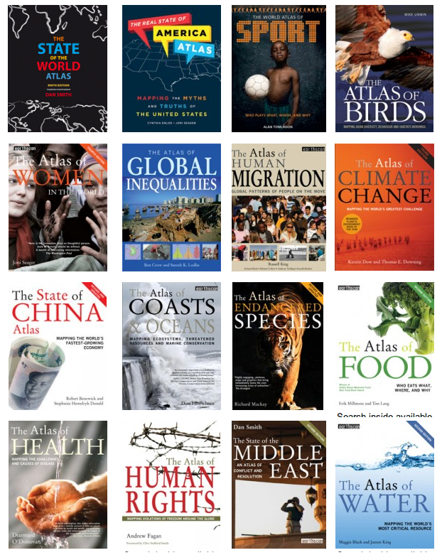
Of course, I want to browse every page of every one of these 100+ page mini-atlases. I suppose The Real State of America and The State of the World ought to be the next ones that occupy a quiet afternoon, but The Atlas of  Water  and The Atlas of Food are no less intriguing.

Closing out this article, here’s an spread from The State of the World Atlas:

Obesity-Burger

Storytelling through Maps and Timelines

Creative Commons license: Nicholas Kenrick

Bagan today. Creative Commons license: Nicholas Kenrick

In the year 1100, the largest city, by far, was Kaifeng, which was twice the size of its nearest competitor, Constantinople, three times the size of the third city on the top five list, Marrakech, which was, at the time, about the size of Kalyan and Cairo. Never heard of Kaifeng or Kalyan? If today’s Kaifeng was located in today’s United States, it would be the nation’s second largest city; in China, where it has been a significant city for a very long while, it would be in the top forty or fifty cities. Kalyan is now part of Mumbai. A hundred years later, Bagan makes the list–it’s no longer an active city, but the site is as popular in Cambodia as Angkor Wat. Add another 100 years and the first of the European cities makes the top five list: Paris. By 1492, just as Europe is waking up to the possibility of its role as a global power, there are no European cities on the list. Instead, it’s Beijing with over a half-million people in the number slot followed by Vijayanagara, Cairo, Hangzhou, and from the Americas, Tenochtitlán.

In 1492, the world map is a fascinating place filled with vaguely familiar names. A large swath of what is now Russia was then the Khanate of Siber; the Mongols are firmly in control of the large area that is now Mongolia; the only people in Australia are Aborigines; and the Caribbean and much of South America are under the control of the Arawak people (who will be killed, in large numbers, by European invaders and their diseases, the first of whom is Columbus). You’ve probably heard of Catherine of Aragon, a Henry VIII wife (remember “Divorced, beheaded, died; divorced, beheaded, survived?”–Catherine’s the one who Henry divorced, setting up a major tiff with the Pope). Anyway…Aragon occupies the eastern half of the Iberian Peninsula in 1492. The Inca are all along the Pacific side of what becomes South America, and the Mayas and the Aztecs are all over what becomes Central America and Mexico. Japan is Japan, Korea is Korea, and remarkably, Poland is a large country–actually a kind of joint project, so the place is called Poland Lithuania.

How do I know all of this? Because I’m having a blast browsing through a new combination of world atlas and history book. It’s called The New Atlas of World History: Global Events at a Glance and it’s been put together by research fellow at England’s Lancaster University named John Haywood.

NewAtlas World HistoryQuite sensibly, Mr. Haywood has produced a book whose broad horizontal pages alternate between an atlas view of the world at various intervals, and a timeline of significant events that describe that time in greater detail.

His story begins around 100,000 when ice sheets covered much of today’s Canada, all of today’s United Kingdom, and the rest of northern Europe. From the ancestral starting place in eastern Africa, homo sapiens migrate first into Asia and China, then across two land bridges, one to what becomes North America and the other (who knew?) across present-day Indonesia and the Indian Ocean across to Australia (which is how the place become populated with Aboriginal peoples). In fact, Europe was settled, or, at least, visited in large numbers, about 5,000 years after Australia. It took even longer for the people who took the now-Alaska land bridge to make their way all the down through the current United States and Mexico, eventually finding themselves in what is now South America.

Looking way ahead to, say, 1900, it’s again a fascinating map and story: there is no Poland, for example, because it has been obscured by the giant Russian Empire, and also, if I’m reading the map correctly, by the Austro-Hungarian Empire, too. On that map, Africa is a collection of colonies belonging to Belgium, Holland, Germany and other countries whose international colonization efforts were ended by a pair of wars that provided plenty of good reason to focus on life at home.

So here’s a rough look at the 1492 map of the world (click on it to see a full-screen PDF with far better detail):
Atlas_Map_Smaller

And, to accompany that layout, here’s a look at the adjacent page, this time providing a timeline view of events that mattered at the time (same story, click to see a PDF that’s easier to read):

Timeline

Of course, the book offers more than just these two layouts. One of my favorites shows the migration routes to the United States, mostly from Europe, circa 1900. The same map contains the sobering stories of indentured servants leaving India for British colonies in Africa. Subsequently, a young attorney and activist named Mohandas Gandhi will understand his power by correcting the situation in South Africa (then, the Cape Colony) before returning to his native India.

So: here’s the history of the world in just over 200 pages, full-color, filled with fascinating stories told in some text, but mainly, through descriptive maps and pictures. It’s a thoroughly modern way to tell our story, and, as you might imagine, it has become a favorite. You’ll get some flavor of the work’s value by clicking on some the links on the book’s catalog page, but there’s really nothing quite like having the whole of it in front of you on a hot Sunday afternoon in the cool shade, preferably with an equally cool drink from some far-off land close at hand.

Big History

After admitting that we cannot yet answer the  obvious–and seemingly unanswerable–question about how and why everything   began, University of Sydney Professor David Christian begins with the creation of the universe about 13 billion years ago. It’s not every historian who would admit, simply:

About the beginning, we can say nothing with any certainty except that something happened.”

He continues explaining this madness: “We do not know why or how it appeared. We cannot say whether anything existed before. We cannot even say that there was a ‘before’ or a ‘space’ for anything to exist in (in an argument anticipated by St. Augustine in the fifth century CE) time and spare may have been created at the same time as matter and energy.”

After that, the big news is not so much the Big Bang Theory (explained here in detail that can be easily understood), but the shift to a neutral electrical charge, enabling the creation of atoms, first simply (mostly, hydrogen and helium atoms), then, in increasingly complicated ways. I like this quote:

Hydrogen is a light, odorless gas which, given enough time, changes into people.”

Leaping ahead, the sun and the planets show up around 4.56 billion years ago, and, helpfully, Professor Christian helps us to understand an earth bombarded by small planetesimals (excellent word, new to me) and without much atmosphere.

The early earth would indeed have seemed like a hellish place to humans.”

As the mix of gases shifted from methane and hydrogen sulfide to carbon dioxide, the early atmosphere would have appeared red–that is, the sky would have seemed to be red, not blue. The blue sky came about because the new oceans–made possible by a drop in temperatures below 100 degrees celsius–allowed oceans to form, and those oceans absorbed much of the CO2.

How about the question of the beginning of life on earth? Again, Christian offers a coherent answer:

Living organisms are constructed, for the most part, from compounds of hydrogen and carbon. Carbon is critical because of its astonishing flexibility. Add hydrogen, nitrogen, oxygen, phosphorous, and sulfur, and we can account for 99 percent of the dry weight of all organisms. It turns out that when conditions are right and these chemicals are abundant, it is easy to construct simple organic molecules, including amino acids (the building blocks of proteins, the basic structural material of all organisms) and nucleotides (the building blocks of genetic code).”

Of course, it’s one thing to assemble the building blocks and another to assemble these parts into a wooly mammoth, or even an amoeba. Christian admits that this is the tricky part: complexity is the appropriate term that causes contemporary scientists to scratch their heads and wonder. The pieces seem to be there, but the complexity of their union and the spark of life may not be so simple.

Maps of Time

Book: Maps of Time: An Introduction to Big History by David Christian

Sure, multi-cell animals are interesting footnotes, but really, isn’t history all about us? Not exactly, not according to the good professor. Turns out, we are just one of many species, and in the scheme of big history, humans are a kind of, well, a kind of weed. We just keep growing, taking everything over, killing off other species, treating the whole earth as our own private amusement park. Within our lifetimes, there will be 10 billion humans on earth, an astonishing increase given that there were, in 1800, just a billion of us. Every dozen or so years, we add another billion or so.

As humans began to migrate into Europe and Asia from their original home in Africa, large animals became extinct because we hunted them down, ate them, used their hides for clothing, used their bones for tools. Giant sloths in the Americas, giant wombats and kangaroos in Australia, mammoths in Siberia. We killed them faster than they could reproduce, and so, they’re gone.

So what makes us so special? Is it really all about thumbs? Sure, thumbs make a difference, but it’s something else entirely. Professor Christian uses the term “collective learning” to describe our “pooling and sharing of knowledge…the types of knowledge that, over time, have given humans their unique power to manipulate the material world. Two factors stand out: the volume and variety of information being pooled, and the efficiency and speed with which information is shared.” Here, he’s not referring to the digital age, but the era before we developed any meaningful form of writing, drawing, or communicating with anything resembling a modern language.

By now, we’re about halfway through the book. Next will come the domestication of animals–in which humans figure out that an animal that is killed for its meat is useful only in the short-term, but an animal that is kept alive for its milk is useful in the long-term. This concept of domestication applies not only to meat/milk animals, but to others whose wool, or other production, can be used not only to satisfy basics needs, but also for exchange to other humans. In time, it’s the idea of exchange that becomes the driver, resulting first in local trade between tiny settlements, then trade routes as fewer people are tied to subsistence farming or hunting/gathering and more are available (typically, more men are available) for pursuits involving trade, travel, and, in time, the accumulation of wealth.

Along the way, humans attempt to understand how and why their world works. Since the ground, the soil, the earth provides the food we eat, we begin to explain the world in terms of an earth spirit. Similarly, the sky seems to contain the origins, the mystical, the unknowable, and so, this, too, becomes a kind of spirit. In time–and mostly within a period of just a few thousand years, mostly in southwestern Asia–we gather these beliefs in the form of religions.

As we, as contemporary, educated humans with every conceivable benefit, attempt to understand our world, and its big history (now a common term combining history and science, by the way), Professor Christian readily admits to what he has done. He has wrapped our beliefs, our knowledge, our stories into what calls “a modern creation myth.”

Chopping Down the Tree of Knowledge

So, during the past few weeks, I’ve been thinking a lot about the visual mapping of ideas.

Scott McCloud suggested that I have a look at the animation being done by Cognitive Media. You’ve probably see their work. I especially enjoy their lectures, often associated with TED-Ed, and their RSA work.

Back to mapping. I’ve been struggling with the tree of knowledge–and its modern equivalent, the mind maps now found in so many places on the internet and in classrooms. This means of structuring information provides the basis for the often-awkward corporate organization chart, now as often undermined by concepts of matrix reporting (you report to me, but we both also report to a lot of other people, kinda, sorta). I’m experimenting with several mind mapping programs, and one (Curio) is especially promising. That’s coming in a later post.

A few years ago, I worked with some folks from Wharton on a new approach to organizational design in which everybody is responsible to everybody else. I liked the idea because (a) I thought it represented what happens in a modern organization with greater precision, and (b) it represented the kind of productive, modern place I wanted to work. The design was a simple circle with about 100 points–and every point was connected to every other point. The concept: simple. The illustration: ridiculously complicated and difficult to understand.

So back to Cognitive Media. They’ve produced a nifty cartoon that helped me to understand the inadequacies of the tree-based design, the plusses and minuses of the network design, and the need for a universal design.

Watch it:

%d bloggers like this: