Experimenting with a New Medium

We all find our comfort zones, but every once in a while, it’s fun to try something new. For me, something new is, in fact, something quite old: a formulation of colored pastels that includes oil. Remember “Cray-Pas” from elementary school art class? I’m playing with the grown-up version, originally designed by Henri Sennelier, in Paris, in response to his friend Pablo Picasso’s request for oil paint that could be applied in stick form.  Nearly seventy years later, Pastels à L’Huile, or Oil Pastels, continue to be a part of art supplier Sennelier’s product line. Since I enjoy working with pastels, I thought I’d try a boxed assortment of 24 oil pastels and consider the possibilities.

Unlike most media, oil pastels can be used to draw, paint or otherwise color on a remarkable range of surfaces including (but not limited to) paper, canvas, cardboard, wood, metal, plastic, or glass. And like watercolor pencils and watercolor sticks, oil pastels can provide the color in a mix with a solvent–essentially providing a very portable set of oil paints with minimalistic clean-up. They look, feel, and behave a bit like lipstick. Have a look at the video and you’ll see the possibilities.

The best way to get a sense of oil pastels is to buy a few a handful (visit Rochester Art Supply, or Dakota Pastels). For a basic introduction to the art and craft, I picked up a used copy of Oil Pastel for the Serious Beginner by John Elliot (I like other titles in this series, especially the ones about watercolor and pastels). You might also visit a few sites, like Eric Green’s Beginner’s Guide to Oil Pastels, or, even better, Explore Oil Pastels with Robert Sloan which is, easily, the best website about oil pastels in the world.

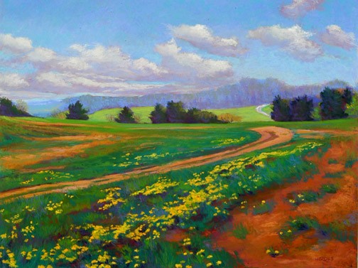
Sloan’s work with oil pastels is excellent. Below, two images from his website gallery, both already sold, but several equally handsome pieces are available.

Of course, there is nothing like getting your hands dirty. Sennelier’s set of 24 assorted oil pastels is just about right for the start–a spectrum mostly comprised of mid-tones, a bit lacking in lights and darks.

At the most basic level, you can use Sennelier oil pastels as you would crayons–an adult version of crayons, carefully isolating each stroke in the same way that some children keep their peas far away from anything else on the dinner plate. For graphic work, that’s a reasonable approach, but you lose out on some of the magical quality of oil pastels. These little guys (they really are fairly little) blend colors just beautifully–but you must use a very light touch to get the best possible effect. Once you start filling the surface’s texture with the pasty output, mixing and refinement becomes challenging.

I found a helpful way to practice, and refine my technique: I use “the wire side” (highly textured) of Canson’s reasonably inexpensive Mi-Teintes paper, and when I start filling  the small pores in the paper with pigment, I have pressed too hard.

Another helpful note: the stickiness requires a special kind of attention. When blending, the stick picks up the blending color, so it’s not unusual to see a yellow oil stick with a film of, say, bright red or green. With dry pastels, you can usually wipe this off easily. With oil pastels, you must be vigilant, always keeping a lint-free bit of cloth nearby so you can wipe stray colors off the sticks. At first, this is annoying, but I got used to it.

Each stick is supplied in a paper wrapper–very useful to keep your hands clean, because the sticks become sticky and softish. But they do break inside the wrappers, and there’s not much you can do about that (then again, you can buy a larger, thicker version of Sennelier Oil Pastels, which may be preferable for some artists).

On and off for a year, I’ve been playing with these oil pastels. At first, I found them to be exceedingly difficult to control, an emotional return to my childhood frustration with Cray-Pas–just too thick, too rich, too everything for my comfort zone. In time, I came to understand the value of a lighter touch. Now, I find myself happy and content, mostly sketching and blending colors, every-so-softly, finding that I can experiment with color mixes with an immediacy and vivacity that’s not readily available in other media. It’s just plain fun to sketch with oil pastels, and if drift into nonrepresentational mode, so much the better. It’s tough for me to get a clear representation of a real life object with these sticks, but that’s why I use other media. It’s tough for me to enjoy the gentle abstraction that I find easy with oil pastels when I try to do the same with other media.

I tried a blending stick–Sennelier Oil Pastel # 221–and at first, I disliked rubbing what seemed like a white wax candle on my work. Then, I tried again, several more times, and I began to appreciate the way the blending stick pushes the vivid colors together. I can do the same with my finger with dry pastels, but the effect is different here (and, besides, finger blending with oil pastels, at least with my fingers, makes an awful mess).

All of which makes me admire the sample work from Robert Sloan even more. I am not yet at a point where I can exert real control over the strokes–and when I see the precision that he achieved on his big cat drawing, I feel good because I know that it is possible for a human being to exert that kind of control on what are, so far, tools that I have not yet mastered.

That’s the fun, of course. If you already know how to do something, maybe there’s not much opportunity to learn. Right now, I am just a beginner, and I celebrate the frustration, the sheer joy in knowing that I can and will learn, and develop at least a modest form of mastery over what amounts to a sophisticated version of crayons (in the best professional sense of the term).

Samples of my work? Perhaps in a few years. For now, I’m happy as a beginning student in a new medium. No need to embarrass myself. I’m learning a lot, and I’m reporting my progress. And doing my best to spread the knowledge I’m gaining along the way.

Another thing I’ve learned about myself (though I suppose this is common to others, too): I am always drawn to collections of bright colors across the spectrum, but these sets are not always the best choice for learning about a new medium. Lights and darks make all the difference, so I will soon be enhancing my basic spectrum set. For those with a bit of money and a sense of adventure, two other sets are probably a better place to begin than the 24 Assorted selection–the wood box set of 50 “Original Picasso Colors” (on sale at Fine Art Store for $117), or, for $50-60 more, the set of 72 colors in a nice cardboard box (Fine Art Store: $173). Both include a useful mix of light, mid and dark tones–of course, the 72 set is preferable. Or, you can just buy a handful of whatever oil pastels you’d like–Sennelier products are widely distributed throughout the world. Just visit a good art supply store.

Sennelier is not the only company offering portable oil sticks–Holbein sells a very wide range of colors (224 to Sennelier’s 120), and Cretacolor sells a similar product under the name AquaStics, which are water soluble. Winsor & Newton sells much larger and thicker Oil Bars–with a different formulation that categorizes their product as more closely related to oil paints in solid form, less aligned with oil pastels (“Don’t mistake them for oil pastels, though – Oilbars are made to a special formulation of linseed or safflower oil and wax.”–from the company’s website). Sennelier also makes and sells oil sticks.

Touched by an Eagle

I was quite taken with Ellen Eagle’s new book, Pastel Painting Atelier.  It’s a classy book, hardcover and quite beautiful, as this atelier series tends to be. Unlike most books about art, unlike most books written for creative people, this one provides several hours of quiet time with the artist at work in her studio, in her mind, with her eyes, with her hands.  She sees beauty in the tiniest of details: the curve of the silhouette of a woman’s face, the arrangement of the old pipes beneath the even older sink in the corner of a Manhattan studio, the private thoughts that take shape in a best friend’s eyes.

Here and there, the book is an instructional work for artists who wish to perfect their pastel technique, but that’s a small part of the whole. (In fact, the obligatory step-by-step demonstrations that end the book are its least essential part). The best parts are small comments that accompany the many sensitive images, often of women who might, in a glance, be dismissed as ordinary. Eagle describes her model, Mei-Chiao, as follows: “the inward gesture of the head to the chest was beautiful to me, and the backward pull of the shoulders is balanced by the triangular opening blouse neckline.” Minor details become a beautiful painting. Same girl, different painting, one that I found by exploring Ellen Eagle’s portrait website, an endeavor I recommend when you have the time to look carefully…

Ellen_Eagle052

The artist’s use of line and color is quite masterful, and throughout the book, it’s easy to get lost in page after page of exquisite, often subtle, portraits. She has a knack for capturing women especially well, almost as if she is drawing and painting their minds as well as their fine features. One of my favorites is below, also taken from her website. She describes the painting below as follows: “In Roseangela’s flesh, I saw warm yellow-greens co-mingling with touches of cool violets and pinks. The planes that faced the light contained color pinks, blues, and greys. Warm tones ran throughout the flesh. Warm, dark burnt sienna defined the depths of her eye sockets. Where the orange dress caught the light, the colors took on a cool temperature. The weight of her clasped hands pulled the dress inward, causing a slight angle away from the light, and the cooler tones gave way to warmer ones.” It’s almost as if she’s writing a poem with colors.

018ee39

This is a gentle book, an inspirational one with the promise of some instruction for the visual artist, but you need not be an artist to see what she sees, and to enjoy the way that Ms. Eagle perceives and so lovingly sees the world.

Here’s the cove. The image on the cover is another favorite. The artist was especially taken with the pose struck by the model. Be sure to visit  Eagle’s website to see the uncropped version.

book

Balancing Technique and Inspiration

A new book about pastels from artist Jean Hirons.  If you buy it by clicking on the link (instead of buying from a more traditional source, the author earns more money for her self-published effort.)

A new book about pastels from artist Jean Hirons. If you buy it by clicking on the link (instead of buying from a more traditional source, the author earns more money for her self-published effort when you click on the book cover and make the purchase through Author House).

Ten or fifteen years ago, I decided to try my hand at pastels. That is, I bought a box of pastels, some paper, and started making bad art. At the time, there were two useful books available: Bill Creevy’s “The Pastel Book,” and Larry Blovits’s “Pastel for the Serious Beginner.” Both of these books were well-organized, and helpful, but neither provided the complete education that I wanted to pursue.

Over time, I bought more (and more) (and more) pastels, experimented with various types of paper, played with and decided that I pretty much hated fixative, bought a field easel, and started spending weekend afternoons making pastel paintings. To be honest, I didn’t much care whether each painting was worth showing to anybody; most of the paintings were wrapped in glassine (which does not smudge the painting) and placed, ever so carefully, into a box. Mostly, my concern has been learning how to pursue a creative process.

Along the way, I have bought just about every book about pastels that I could find. I’ve scoured the lists of the top publishers (then, North Light Books and Watson-Guptill, the latter now part of North Light). I’ve been inspired by the beautiful work and eye-opening creative thinking so elegantly presented by Elizabeth Mowry her two best books, “The Pastelist’s Year,” which looks at painting through the seasons) and “The Poetic Landscape,” which examines perception and the psychology of art through pastel painting. Both of Maggie Price’s books have proven very useful: “Painting with Pastels” and the more specialized “Painting Sunlight and Shadows with Pastels.” The out-of-print book that taught me ever so much was Doug Dawson’s “Capturing Light and Color with Pastel.” The more sophisticated, and modestly entitled, “Pastel Pointers” by Richard McKinley, is only part of a larger instructional program that can be pursued online or in the always-excellent Pastel Journal magazine.

Still, I wish I was just starting out today, if only to do so under the guidance of Jean Hirons and her new (self-published) book, “Finding Your Style in Pastel.”

"Antietam Barns" by pastel artist Jean Hirons

“Antietam Barns” by pastel artist Jean Hirons

From the very first image on the very first page, I sensed, I can probably do this. Immediately, my confidence level increased. A brief but substantive review of types (soft, hard) and brands (Sennelier, NuPastel) is followed by a rundown on the many surfaces (papers, mostly) now available (with running commentary on the advantages of each ground), and comments on strokes, blending, layering, and other techniques. I like the way Ms. Hirons keeps the story moving; she makes her points clearly and with the right illustrations, then moves on. (She is my kind of teacher!) There’s a lot of “show me what I need to know,” as with a quartet of small images to explain toning and underpainting (two methods of pre-painting a surface).

By page 63, she’s defining personal styles. This is, of course, what every artist wants to know. Basic techniques are fine, but how do I make my paintings my own? So begins one of the better explorations of composition, value, edges and color theory that I’ve seen in book form. As with the earlier chapters, the author does not linger; the pace remains solid, brisk and professional. Once again, two images from the artist’s online gallery help to make the point about the difference between the works of an artist who pursues a distinctive, personal style:

Carroll County Farm by Jean Hirons

Carroll County Farm by Jean Hirons

"Dandelion Spring" by Jean Hirons

“Dandelion Spring” by Jean Hirons

Same artist, different seasons, different color palettes, varying levels of edge sharpness, atmospheric color, amount of foreground detail, use of line and shape, mood, overall colorcast, color temperature, and so much more.

Hirons rarely insists upon one particular technique or approach. Instead, she runs through available options, the techniques required to achieve the desired effects, and well-chosen images to illustrate each point.

Along the way, she also addresses the questions that lurk in the back of every pastelist’s mind. To what extent do I paint the colors that I observe? How do shadows work: how dark, how much local color, how much should I shift the color temperature? How far should I go with my interpreted color? To what extent, and under which conditions, should I pursue abstraction?

Yes, there are some step-by-step demonstrations, but only a few (I’ve never been a big fan of books filled with step-by-step demos because I tend to lose interest unless I am actually painting at the same time as I am reading). Hirons uses them only in her final problem solving chapter (where they can do the most good).

In one of several appendices, the author recommends books about art, color, composition, landscapes, and, inevitably, pastels. Somehow, her list of recommended titles (which I just found as I was writing this last sentence) matches my list (at the top of this article) just about one-for-one. She adds “Pure Color,” a compendium of excellent pastel work by contemporary artists. To her list of materials sources, I would certainly add the venerable New York Central Art Supply near Greenwich Village.

Over time, self-published books can become hard-to-find (the author depletes the current stock and may or may not decide to continue to be a publisher–an especially challenging decision for an artist who is not, by trade, a publishing mogul). That’s why I always recommend that a self-published book be purchased immediately. In this case, the bound book–a 200-page, full color, very handsome paperback–costs just over $50, but the same book can be purchased for just $3.99 as an eBook. Despite my interest in all things digital, I would opt for the paperbound edition because I like surrounding myself with very good books. And this one fits, very nicely indeed, into that category.

A Parisian History in Color

sennelier_couvertureIn Paris, on the Quai Voltaire, amidst antique dealers of the highest order, along the left bank of the Seine, directly across the river from the famous Louvre museum, there is a shop.

Sennelier-Interieur-In 1887, or, perhaps, 1888, the shop was nearly bankrupt. With the sale, former shop owner M. Prevost, makes dreams come true. The new owner, Gustave Sennelier, always hoped to own a shop where he could manufacture and sell his own artist’s pigments. And so, the shop became known by the sign visible to all of Paris, Sennelier: Couleurs Pour Artistes.

This was an especially exciting time to be selling colors and working with artists in Paris. The impressionists enjoyed their first successful group show in Paris in 1886.  Painters were experimenting with color and light, trying new formulas and new ideas, and often relied upon the good advice of the chemists who were emerging as colorists. (Previously, pigments were sold in pharmacies as a sideline; art supply stores were still a relatively new idea.) As chemistry and art intertwine, artists now regarded as legend were working professionals who purchased their supplies from Sennelier. Cezanne was one of many in Paris who frequented the shop; others included Pierre Bonnard, Robert Delauney, and Pablo Picasso.

Seeking new products and new opportunities, Sennelier’s pigments found popular use for batik (the pigmentation of decorative fabrics), painting on porcelain, and in new formulations for artists, including, for example, new oil pastels. “Picasso adopted it immediately. He asked for it in 48 colors of which–Picasso’s grey period required it–10 were shades of grey, a heresy in the age of colors.” Artists used the new oil pastels to start an oil painting, allowing the fluidity and ease of sketching onto the canvas. Then, the painting would be completed in a classical oil painting style.

facade-quai-GFThe Sennelier family has passed knowledge, chemistry, color sense and business sense from generation to generation. In a sense, the new book, Sennelier: A History in Color by Pascale Richard, is a family biography. As with the Parisian landscape, the family is part of a bolder story: the powerful relationship between science (chemistry) and a tremendous assortment of artistic accomplishments. The book is filled with full-page images of Jackson Pollack paintings and store shelves filled with pigments; photos of antique paint tubes and pastel drawings by Edgar Degas; spectacular old city scape photos of the old shop and inside the old lab and photos of the shop today, a place that hasn’t changed much in a century. If you are planning a visit to the Louvre, do find the time to cross the Seine, make the left turn, follow the classic old buildings until you reach number 3 Quai Voltaire. At the least, you will buy a notebook or a sketchbook (Picasso bought lots of them), and perhaps you will be persuaded to buy a set of Sennelier pastels, which are among the finest in the world, or oils or watercolors, or artist’s pads. You can buy some, or even most, of this merchandise in many U.S. art supply stores, but it’s not the same experience. There is magic in the old shop, magic that is so loving transported into book format.

dan

Daniel Greene is one of my favorite artists. Click on the picture to explore his spectacular work.

It is a joy filled story: the idea of bringing Sennelier products to the U.S., the magic of those pastels in the hands of a great contemporary artist. Daniel Greene is such an artist, and his two-page spread of Manhattan’s Franklin Street subway station is a wonder. So, too, are the simple photos of the neatly-ordered tortillons in a century-0ld drawer in the old shop.

For about ten years, I have so enjoyed using Sennelier pastels. The freshness and depth of their color makes every painting special. When I have a Sennelier pastel in my hand, I sense that there is legend there. I visited the shop in Paris, and sensed some of the history, but it was difficult to understand how the story fit together. When I started reading the book, I loved the combination of new and vintage photographs, art and artists at work, and the story told in both French and English blocks of prose. About a third of the way through the book, I realized that I was grinning. And I wondered about the last time I had grinned my way through the reading of an entire book.

Several years ago, NPR did a wonderful story about the Sennelier shop. Listen to it here.

Even better, I think, is the photo essay and commentary on the blog A Painter in Paris. The photo below should encourage you to visit both the blog and the store. Enjoy!

aa_DSCN3354