Next Spring, Near Paris

Start saving your money. Next May, go to Paris. Leave early on the morning–there’s an 820AM from Paris’s Saint-Lazare Station to Vernon, and then, there’s the taxi. The train arrives at 9:05AM at Vernon, and the cab will get you to the front entrance of Monet’s home and gardens by about 9:15AM. You want to arrive early, perhaps catch the mist rising from the water garden, perhaps take a few pictures or just gaze before the crowds populate every view. (Get there earlier, if you can; it’s always best to arrive first-in-line here.)

Sigh.

Summer is ending. There is autumn color: the purples and luminous yellows, the garish reds and the beginnings of orange trees reflected in the water. But there is nothing like spring.

In 1883, Claude Monet settled in Giverny, a village fifty miles outside paris. He rented a house with an orchard, the future Clos Normand, the flower garden at the front of the house that broke with the traditional idea of a pleasure garden.

9781419709609So begins the tale, told mostly in large, vivacious images, of Claude Monet’s extraordinary gardens (and home), told with love and with style through Jean-Pierre Gilson’s photographs, with text by Dominique Lobstein. Published by Abrams–one of the best in the world at this type of book, the visual tour begins, as it should , in the purple haze and tangled wisteria branches hanging over the famous Japanese bridge. The photograph is subdued; there are no bright colors yet. On the next two-page spread, there are brightly–colored bushes and their quiet reflections, house peeking out of the background behind some trees. Flip to the next of these several two-page spreads and it’s a riot of roses, glowing in the sun, red, pink, nearly white, braced by green leaves so dark and sometimes so nearly translucent, bold as can be. The text begins.

And on the next spread, so does spring. After the prelude, spring commences with a field of pink tulips, clean green fences and stair rails, dark green-blue leaves, and the stunning-but-simple house with its own pink facade and blue-green shutters. The effect is stunning, as if in a painting–and here, that’s precisely the effect that the master painter intended. To be at Giverny is to live inside a Monet painting, at least for a morning.

It’s not all cluttered with noisy flowers and oh-so-subtle impressionist gardening. “Monet wanted a garden that could ‘breathe’ with flowers, bushes and an open vista…” so he removed the many trees from the old orchard, and replaced them with Japanese cherry trees that yield, at least for a brief time in the spring, lighter-than-air blossoms, punctuated, here and there, as in any number of his paintings, with spots of bright color; here, red and purple tulips.

I wish I knew the name of every flower (and I wish the author’s captions included this information!). The phenomenal two-page spread showing yellow towers of flowers two stories high, dappled with pink-and-purple irises, golden yellow somethings (frustrated…), and it’s followed by several more. (I want to it to be spring today, and I want to go to Giverny tomorrow.)

And then, when your head is beginning to explode because Monet was such a genius, there’s a pair of small green rowboats, a field of happy daffodils, and in the distance, the Japanese bridge that he painted so often. Here, with a less exhausting spectrum, it’s possible to rest and reflect, and observe. The yellowy green of the locust leaves in contrast with the deep green of the background trees–with just a hint of small violet flowers to set the counterpoint.

The flighty, wavy petals of mauve tulips surprise me every time I see them. Here, they’re pictured with the famous lily pad pond in the fuzzy distance, and the sharp, sun-dappled orange wallflowers in the foreground. Another two-page spread, one of my favorite two-page spreads in the book.

Just checking–I’m not even half way through the book. Some surreal lily pad images–two look as though they were made for a science fiction film, but they are real–and then, with a page turn, there are paths of dry ochre leaves on the ground, paths with strong color of fall, not spring. The quiet beauty of barren trees and cool skies, the yellowing willow and golden hour light, it’s bittersweet. Moreso because the last set of images show the house with shutters now closed tight.

But then, we get to go inside. A row of old copper pans artfully hung in front of a blue-and-turquoise tiled wall with cabinets. A yellow dining room whose walls are filled with Japanese prints (Monet collected them, and they are a highlight of every Giverny tour, but few people spend the time to look at them as closely as the artist once did). It’s a classy old country home, less formal than most. And then, there’s a small staircase leading down to a room with Persian carpets on the floor and a whole lot of miscellaneous Monet paintings almost haphazardly scattered on the walls. It’s his studio.

The book closes with snow. Which means spring is coming again. Soon.

Touched by an Eagle

I was quite taken with Ellen Eagle’s new book, Pastel Painting Atelier.  It’s a classy book, hardcover and quite beautiful, as this atelier series tends to be. Unlike most books about art, unlike most books written for creative people, this one provides several hours of quiet time with the artist at work in her studio, in her mind, with her eyes, with her hands.  She sees beauty in the tiniest of details: the curve of the silhouette of a woman’s face, the arrangement of the old pipes beneath the even older sink in the corner of a Manhattan studio, the private thoughts that take shape in a best friend’s eyes.

Here and there, the book is an instructional work for artists who wish to perfect their pastel technique, but that’s a small part of the whole. (In fact, the obligatory step-by-step demonstrations that end the book are its least essential part). The best parts are small comments that accompany the many sensitive images, often of women who might, in a glance, be dismissed as ordinary. Eagle describes her model, Mei-Chiao, as follows: “the inward gesture of the head to the chest was beautiful to me, and the backward pull of the shoulders is balanced by the triangular opening blouse neckline.” Minor details become a beautiful painting. Same girl, different painting, one that I found by exploring Ellen Eagle’s portrait website, an endeavor I recommend when you have the time to look carefully…

Ellen_Eagle052

The artist’s use of line and color is quite masterful, and throughout the book, it’s easy to get lost in page after page of exquisite, often subtle, portraits. She has a knack for capturing women especially well, almost as if she is drawing and painting their minds as well as their fine features. One of my favorites is below, also taken from her website. She describes the painting below as follows: “In Roseangela’s flesh, I saw warm yellow-greens co-mingling with touches of cool violets and pinks. The planes that faced the light contained color pinks, blues, and greys. Warm tones ran throughout the flesh. Warm, dark burnt sienna defined the depths of her eye sockets. Where the orange dress caught the light, the colors took on a cool temperature. The weight of her clasped hands pulled the dress inward, causing a slight angle away from the light, and the cooler tones gave way to warmer ones.” It’s almost as if she’s writing a poem with colors.

018ee39

This is a gentle book, an inspirational one with the promise of some instruction for the visual artist, but you need not be an artist to see what she sees, and to enjoy the way that Ms. Eagle perceives and so lovingly sees the world.

Here’s the cove. The image on the cover is another favorite. The artist was especially taken with the pose struck by the model. Be sure to visit  Eagle’s website to see the uncropped version.

book

Make Good Art!

Wonderful, level-headed speech to graduating students at Philadelphia’s University of Arts by writer Neil Gaiman. You may not know his name, but you know his work: Coraline, comic books,graphic novels (Sandman series) short fiction, books, here an episode of Dr. Who, there a Simpsons episode, the list is long. At age 15, he made a list of what he wanted to do, then got started, and apparently, never stopped.  He discusses the sense of fraud that successful creative professionals experience; the nonsense about creative people wearing a tie and going to an office every morning, the importance of learning to say “no”. He reset his balance between writing for a living and spending a lot of time writing emails by responding to each one. He encourages creators to take chances and make mistakes; you acknowledges that the ultimate life saver is the secret that creative people share that others do not: we have the ability to make art.

It’s a terrific video, and well worth twenty minutes (or so) of your time.

His response to things going awry, as they will: “Make good art!”

The one thing that you have that nobody else has: “You!” (Your ideas, etc.)

The moment that you believe that you’re walking down the street naked, that you’re showing too much, that’s the moment . But you’ll have no idea. And what would be the fun in making something that you know is going to work? (Gee, he’s smart!)

A Teacher Who Paints Ideas

When a student faces a new subject, there is a certain comfort in structure, process, facts, and the rigorous routine that defines most teaching situations. Teachers find comfort in that structure: first, the basics, then, perhaps, the materials, then, the history followed by waves of increasingly specific information. In theory, it all makes sense. In practice, when faced with the sloppiness of real life, the structure may be exactly what’s not needed because it interferes with the real learning that occurs as a result of experimentation and making glorious mistakes.

I guess that’s why I had so much trouble understanding what Tom Hoffman was doing. Instead of writing a book that began with materials (in this case, watercolor paints, brushes, papers, and accessories), he begins by admitting that watercolor painting is not easy to do, that it is sloppy, messy, difficult to master, wasteful of expensive paper, and then eschews anything resembling a traditional learning process. Instead, he focuses on the most dangerous of all educational concepts: ideas.

Allow me to begin where he first captured my imagination, with a watercolor painting by an extraordinarily talented artist named Lars Lerin.

operaQuoting Hoffman:

The palette is limited to three colors, and almost all of the edges of the shapes are hard. In the realm of value, however, the artist pulls out all the stops. Never merely black, his deepest darks remain full of color. He limits the lightest lights to just a few stops, making everything else seem to be lit by the low gleam of a lantern in a gilded pattern.

With this glorious visual introduction, he begins where most instruction books ought to begin: by encouraging direct observation, followed by critical thinking (would this make a good painting? what appeals to me, and might also appeal to the person looking at my finished work?) and creative thinking (how can I bring the visual ideas to life in the best possible way?) Hoffman does not begin by focusing on materials. He begins by focusing on the process that every artist shares. This leads to two very helpful essays, one entitled “Knowing Where to Begin” and the other, quite reasonably, “Knowing When to Stop.” In between, he explains the process by examining a very common part of the painting process: thinking through the best way to visualize the shapes and forms and values with just enough detail to pull it all together.

Hoffman Skaftafell

Simplicity in pattern and form, a very effective work by Tom Hoffman.

Step back for a moment. Imagine learning history that way. It’s never about the details. It’s always about the whole form. (But in school curriculum, it’s always about the details. Which we always forget.)

A very colorful Juarez Market in Oaxaca is filled with detail. It’s the centerpiece of a chapter entitled “Knowing What Not to Paint.” This leads to thoughts and illustrations about shape and form, and a key concept: simplicity.

A lovely streetscape by the esteemed watercolorist Alvaro Castagnet show how color and light can be handled in the simplest possible way, and yet, with skill, they can result in a painting that appears to be quite complex. The secret, Hoffman explains, is thinking in layers.

Thinking in layers is an additive technique–place one layer of color, then another–but it requires subtractive thinking to begin. That is, you must look at a scene, observe it carefully, determine which areas can be isolated and painted with a single color wash without interfering with other areas. For example, a red wall might be washed, but the blue roof should not be washed in the same layer–unless you’re seeking purple results.

A market in Puerto Rico, painted by Tom Hoffman, provides an illustration of wide dynamic range (note the darks at the top, the lights in the distance),  layering and simple design for optimum impact.

A market in Puerto Rico, painted by Tom Hoffman, provides an illustration of wide dynamic range (note the darks at the top, the lights in the distance), layering and simple design for optimum impact.

Hoffman also encourages the use of a wide dynamic range: the lightest lights and the darkest darks are what makes a painting come to life. Too often, he explains, the range is almost exclusively in the middle tones, and, as a result, the work lacks energy, contrast, and a compelling reason for anybody to pay much attention. Again, appreciate the metaphor because it applies to so many aspects of life: dark and light, silent and boisterous, and so on.

Final lesson: simplify to the point of abstraction. His most powerful work tends to be simple masses of color, artfully arranged.

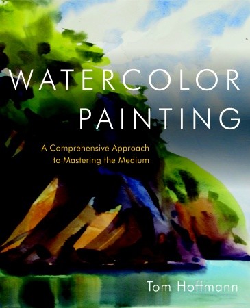
The name of the book is Watercolor Painting: A Comprehensive Approach to Mastering the Medium.

Watercolor Hoffman

The Global Art Gallery

oil229SAbove, a lovely British landscape, described, in the words of the artist Rob Adams on his Painter’s Blog, as follows:

This is towards the end of the day on the charmingly named “Hogs Trough Hill”. The light was super, though once I stopped it was very cold! 20in by 12in.”

Here’s another picture by Rob, one that he likes very much, and I do, too.

2010S01S

I mention Rob, and his paintings, in part because I enjoyed my visit to his site and the art I found there, but also to note a remarkable phenomenon.

Rob’s site is filled with his work. Some of it is very, very good. Some of it, by his own admission, needs more time and attention, and yet, he is perfectly comfortable posting both the good and the not-great, along with comments that detail where he feels he fell short, what he intends to complete or rework later on.

In itself, this is a rather new way to think about the interactions between artists and their public. It’s very much like visiting an artist in his (or her) studio, and being allowed to see everything the artist has on hand, including works-in-progress, complete with extensive commentary. Rob is a good writer, too, and he often writes interesting essays about his work, some instructional, some musings, many quite interesting. So here we are, citizens of the world, with the newfound ability to visit art studios throughout the world, to gain insights from artists about their work, and, if we like, we can grab the occasional jpeg or png and use their work as digital wallpaper (with or without their knowledge or permission–a pitfall of the present system).

Some of Rob’s artwork is oil, a bit of it is acrylic, much of it sketchbook work from life drawing classes, and, to my delight, some of it is watercolor.

Water116SI have never met Rob, but he mentioned that he enjoys painting old church graveyards, even though nobody buys those paintings. That made me think about my role in all of this. A few hours ago, I did not know that Rob existed. I’ve enjoyed Rob’s portfolio this evening, and I liked this particular painting enough to show it to you, and to suggest that you explore the carousel of images available by clicking on the graveyard work. So here I am, promoting the efforts of an artist in a far off nation, and here you are, contemplating the way he gets the texture of the stones just right, how the light plays in the path and on the green grass, and maybe, just maybe, you will click on the image to see more of his work. Who knows, you might even buy one of his paintings.

We’ve all been at this internet thing for a good long while now. It never ceases to amaze me, the ways that we’re all connected, the ways in which we influence one another’s time and behavior via little more than a screen, a keyboard and some circuitry.

Rob, I wish I could paint half as well as you do. I learned a lot by looking at your paintings. And I will do so again, soon.