Masterful Visualizing

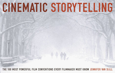
In my last post, I recommended a book entitled The Writer’s Journey: Mythic Structure for Writers by Christopher Vogler. As a companion, I recommend another book from the same publisher, Michael Weise Productions. This one is entitled Cinematic Storytelling: The 100 Most Powerful Film Conventions Every Filmmaker Must Know. It’s written by Jennifer van Sijll. Like The Writer’s Journey, Cinematic Storytelling is useful to the one telling the story, and to the reader or audience member on the receiving end. Why does this book matter? Because we’re rapidly developing into a world of visual storytellers–smartphones and digital cameras in hand–and it would be wonderful if everyone could do their job just that much better.

CInematicStory_website_largeBasically, this book is an encyclopedia of visual storytelling techniques, but it’s fun to browse because every idea is illustrated by frames from a well-known or significant film–and each sequence is presented with the relevant bit of the screenplay along with perceptive commentary from the author.

Some are easily understood by the audience, and as a result, they must be used judiciously by the filmmaker or storyteller: the slow-motion sequence in Martin Scorsese’s Raging Bull; the freeze frame that ends Butch Cassidy and the Sundance Kid; the fast-motion sequence in the French film, Amelie; the famous flashback in the Billy Wilder film, Sunset Boulevard; the visual match cut that transforms a bone into a spaceship in 2001: A Space Odyssey; the long dissolve between young Rose and Old Rose in Titanic.

A specialty lens was used by Orson Welles in Citizen Kane–perhaps the movie most often used as an example to illustrate a variety of techniques. Sometimes, a telephoto is the appropriate storytelling choice, and sometimes, it’s the wide angle. These are not random, on-the-fly choices; instead, they are carefully considered during the storyboard phases of film development.

In this entry featuring The Graduate, the author explains the use of a "rack-focus"--here, shifting the focal point from one character to another. The author explains, "Unseen by Elaine, who is still facing Ben, Mrs. Robinson stands in the doorway. Mrs. Robinson is out-of-focus and ghost-like. When Elaine spins around, Mrs. Robinson is pulled into focus, and Elaine is thrown out of focus (Image 4). Every line in Mrs. Robinson's defeated face now shows. After a beat, Mrs. Robinson disappears from the door. When Elaine turns back to Ben, her face remains momentarily blurred, externalizing her confusion. At the moment of recognition, her face is pulled back into focus.

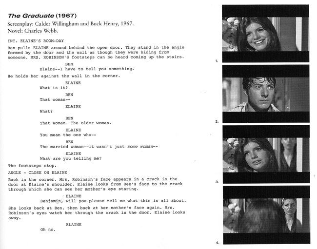
In this entry featuring The Graduate, the author explains the use of a “rack-focus”–here, shifting the focal point from one character to another. The author explains, “Unseen by Elaine, who is still facing Ben, Mrs. Robinson stands in the doorway. Mrs. Robinson is out-of-focus and ghost-like. When Elaine spins around, Mrs. Robinson is pulled into focus, and Elaine is thrown out of focus (Image 4). Every line in Mrs. Robinson’s defeated face now shows. After a beat, Mrs. Robinson disappears from the door. When Elaine turns back to Ben, her face remains momentarily blurred, externalizing her confusion. At the moment of recognition, her face is pulled back into focus.

Selecting a particular point-of-view (POV) can be a critically important aspect of storytelling, as with the below-the-swimmer underwater sequence just before the first swimmer is killed by a shark in JAWS. For which scenes is a low-angle shot most appropriate (character POV for E.T. would be one example), or for which would a high-angle shot be the better creative choice? When does it make sense to use a tracking shot (the camera is mounted on a tripod that glides along tracks; some low-budget achieve similar results by employing a wheelchair)?

Lighting is another variable. In American Beauty, there’s a scene illuminated by candlelight. In E.T., the search is conducted by flashlights and car headlights that illuminate an otherwise dark nighttime landscape.

In Barton Fink, individual shots of props (hotel stationery, an old typewriter) add visual context. Wardrobe is another defining option. So, too, is the use of location as a theme, a concept so masterfully used by director David Lynch in the vaguely creepy Blue Velvet.

It’s not always about what is seen. Sometimes, the scene contains less information, and the story or theme is carried by music or sound effects. Back to Barton Fink for the eerie sense of surreal sound and its ability to paint a picture of each character’s inner world.

A Teacher Who Paints Ideas

When a student faces a new subject, there is a certain comfort in structure, process, facts, and the rigorous routine that defines most teaching situations. Teachers find comfort in that structure: first, the basics, then, perhaps, the materials, then, the history followed by waves of increasingly specific information. In theory, it all makes sense. In practice, when faced with the sloppiness of real life, the structure may be exactly what’s not needed because it interferes with the real learning that occurs as a result of experimentation and making glorious mistakes.

I guess that’s why I had so much trouble understanding what Tom Hoffman was doing. Instead of writing a book that began with materials (in this case, watercolor paints, brushes, papers, and accessories), he begins by admitting that watercolor painting is not easy to do, that it is sloppy, messy, difficult to master, wasteful of expensive paper, and then eschews anything resembling a traditional learning process. Instead, he focuses on the most dangerous of all educational concepts: ideas.

Allow me to begin where he first captured my imagination, with a watercolor painting by an extraordinarily talented artist named Lars Lerin.

operaQuoting Hoffman:

The palette is limited to three colors, and almost all of the edges of the shapes are hard. In the realm of value, however, the artist pulls out all the stops. Never merely black, his deepest darks remain full of color. He limits the lightest lights to just a few stops, making everything else seem to be lit by the low gleam of a lantern in a gilded pattern.

With this glorious visual introduction, he begins where most instruction books ought to begin: by encouraging direct observation, followed by critical thinking (would this make a good painting? what appeals to me, and might also appeal to the person looking at my finished work?) and creative thinking (how can I bring the visual ideas to life in the best possible way?) Hoffman does not begin by focusing on materials. He begins by focusing on the process that every artist shares. This leads to two very helpful essays, one entitled “Knowing Where to Begin” and the other, quite reasonably, “Knowing When to Stop.” In between, he explains the process by examining a very common part of the painting process: thinking through the best way to visualize the shapes and forms and values with just enough detail to pull it all together.

Hoffman Skaftafell

Simplicity in pattern and form, a very effective work by Tom Hoffman.

Step back for a moment. Imagine learning history that way. It’s never about the details. It’s always about the whole form. (But in school curriculum, it’s always about the details. Which we always forget.)

A very colorful Juarez Market in Oaxaca is filled with detail. It’s the centerpiece of a chapter entitled “Knowing What Not to Paint.” This leads to thoughts and illustrations about shape and form, and a key concept: simplicity.

A lovely streetscape by the esteemed watercolorist Alvaro Castagnet show how color and light can be handled in the simplest possible way, and yet, with skill, they can result in a painting that appears to be quite complex. The secret, Hoffman explains, is thinking in layers.

Thinking in layers is an additive technique–place one layer of color, then another–but it requires subtractive thinking to begin. That is, you must look at a scene, observe it carefully, determine which areas can be isolated and painted with a single color wash without interfering with other areas. For example, a red wall might be washed, but the blue roof should not be washed in the same layer–unless you’re seeking purple results.

A market in Puerto Rico, painted by Tom Hoffman, provides an illustration of wide dynamic range (note the darks at the top, the lights in the distance),  layering and simple design for optimum impact.

A market in Puerto Rico, painted by Tom Hoffman, provides an illustration of wide dynamic range (note the darks at the top, the lights in the distance), layering and simple design for optimum impact.

Hoffman also encourages the use of a wide dynamic range: the lightest lights and the darkest darks are what makes a painting come to life. Too often, he explains, the range is almost exclusively in the middle tones, and, as a result, the work lacks energy, contrast, and a compelling reason for anybody to pay much attention. Again, appreciate the metaphor because it applies to so many aspects of life: dark and light, silent and boisterous, and so on.

Final lesson: simplify to the point of abstraction. His most powerful work tends to be simple masses of color, artfully arranged.

The name of the book is Watercolor Painting: A Comprehensive Approach to Mastering the Medium.

Watercolor Hoffman

The Global Art Gallery

oil229SAbove, a lovely British landscape, described, in the words of the artist Rob Adams on his Painter’s Blog, as follows:

This is towards the end of the day on the charmingly named “Hogs Trough Hill”. The light was super, though once I stopped it was very cold! 20in by 12in.”

Here’s another picture by Rob, one that he likes very much, and I do, too.

2010S01S

I mention Rob, and his paintings, in part because I enjoyed my visit to his site and the art I found there, but also to note a remarkable phenomenon.

Rob’s site is filled with his work. Some of it is very, very good. Some of it, by his own admission, needs more time and attention, and yet, he is perfectly comfortable posting both the good and the not-great, along with comments that detail where he feels he fell short, what he intends to complete or rework later on.

In itself, this is a rather new way to think about the interactions between artists and their public. It’s very much like visiting an artist in his (or her) studio, and being allowed to see everything the artist has on hand, including works-in-progress, complete with extensive commentary. Rob is a good writer, too, and he often writes interesting essays about his work, some instructional, some musings, many quite interesting. So here we are, citizens of the world, with the newfound ability to visit art studios throughout the world, to gain insights from artists about their work, and, if we like, we can grab the occasional jpeg or png and use their work as digital wallpaper (with or without their knowledge or permission–a pitfall of the present system).

Some of Rob’s artwork is oil, a bit of it is acrylic, much of it sketchbook work from life drawing classes, and, to my delight, some of it is watercolor.

Water116SI have never met Rob, but he mentioned that he enjoys painting old church graveyards, even though nobody buys those paintings. That made me think about my role in all of this. A few hours ago, I did not know that Rob existed. I’ve enjoyed Rob’s portfolio this evening, and I liked this particular painting enough to show it to you, and to suggest that you explore the carousel of images available by clicking on the graveyard work. So here I am, promoting the efforts of an artist in a far off nation, and here you are, contemplating the way he gets the texture of the stones just right, how the light plays in the path and on the green grass, and maybe, just maybe, you will click on the image to see more of his work. Who knows, you might even buy one of his paintings.

We’ve all been at this internet thing for a good long while now. It never ceases to amaze me, the ways that we’re all connected, the ways in which we influence one another’s time and behavior via little more than a screen, a keyboard and some circuitry.

Rob, I wish I could paint half as well as you do. I learned a lot by looking at your paintings. And I will do so again, soon.

Chopping Down the Tree of Knowledge

So, during the past few weeks, I’ve been thinking a lot about the visual mapping of ideas.

Scott McCloud suggested that I have a look at the animation being done by Cognitive Media. You’ve probably see their work. I especially enjoy their lectures, often associated with TED-Ed, and their RSA work.

Back to mapping. I’ve been struggling with the tree of knowledge–and its modern equivalent, the mind maps now found in so many places on the internet and in classrooms. This means of structuring information provides the basis for the often-awkward corporate organization chart, now as often undermined by concepts of matrix reporting (you report to me, but we both also report to a lot of other people, kinda, sorta). I’m experimenting with several mind mapping programs, and one (Curio) is especially promising. That’s coming in a later post.

A few years ago, I worked with some folks from Wharton on a new approach to organizational design in which everybody is responsible to everybody else. I liked the idea because (a) I thought it represented what happens in a modern organization with greater precision, and (b) it represented the kind of productive, modern place I wanted to work. The design was a simple circle with about 100 points–and every point was connected to every other point. The concept: simple. The illustration: ridiculously complicated and difficult to understand.

So back to Cognitive Media. They’ve produced a nifty cartoon that helped me to understand the inadequacies of the tree-based design, the plusses and minuses of the network design, and the need for a universal design.

Watch it:

The Art of Inge

Below, a picture of Inge Druckery with her reducing glass. Why a reducing glass, and not, say, a traditional magnifying glass? Because a reducing glass allows the user to step away from the visual work. By stepping away, the artist/designer can see the whole, and the relationship between the many pieces of a visual presentation.

Inge 1Inge Druckery is one of the world’s truly great teachers of type design, and, more generally, she has provided designers of all kinds with tremendous inspiration, especially in the combinations of typography and graphic design that so dominate our world, our screens, our print materials.

And now, Edward Tufte (one of her students) has executive produced a 37-minute film, available free, about Druckery’s life and work. The images are striking in their simple elegance, and there are plenty of them. You can watch the film by visiting Mr. Tufte’s site, or simply clicking on the video at the top of this article. This is a film to watch full-screen, in a quiet room free from distracting glare, without interruption, with a patience and a keen eye. Do so, and you will be rewarded with an experience very much akin to attending an extremely well-crafted art museum exhibition on an extremely interesting topic. Do not hurry. Do this when your time permits. The images and ideas will stay with your afterwards.

What sorts of things are presented? The extremely precise Roman alphabet, the letterforms that are so solidly architectural in their L, E, T, and V forms, and so much in motion in the S, so beautifully balanced as curves meet straight edges in the B and, especially, the tricky R form. Simple explanation, elegant presentation.

Fascinating.

Here’s a progression of the letter R, rendered by hand with a proper broad lettering brush, with each letterform progressing toward an ideal. Here, the most basic of old analog form presages a perfection now commonplace in digital typography. Commonplace, but not common. And in the common hand, perhaps there is greater perfection, more of the Lord’s hand and the human progress toward excellence, than digital allows.

R Progression

%d bloggers like this: