The artist’s name is Mary Whyte. I first encountered her watercolor work in her book, Watercolor for the Serious Beginner. At the time — I’d say around 1999 — I knew very little about painting watercolor pictures. Basically, she was my first teacher, or, maybe, one of two or three people who had written really good books to get me started.
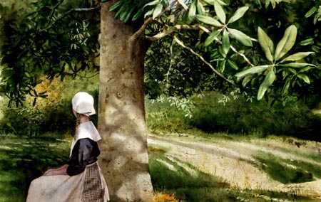
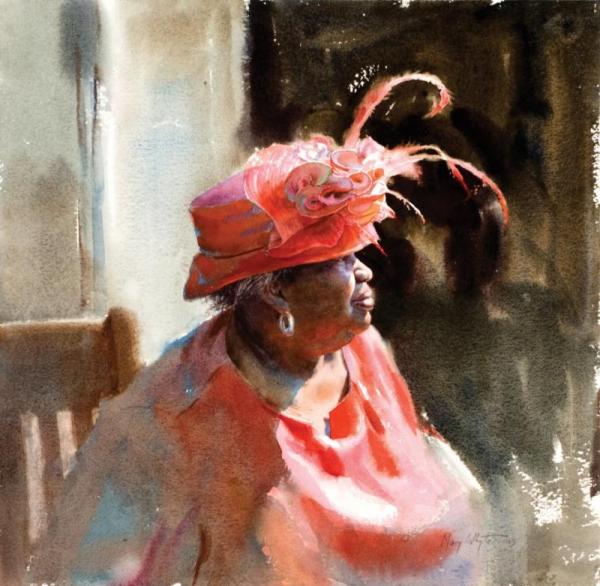
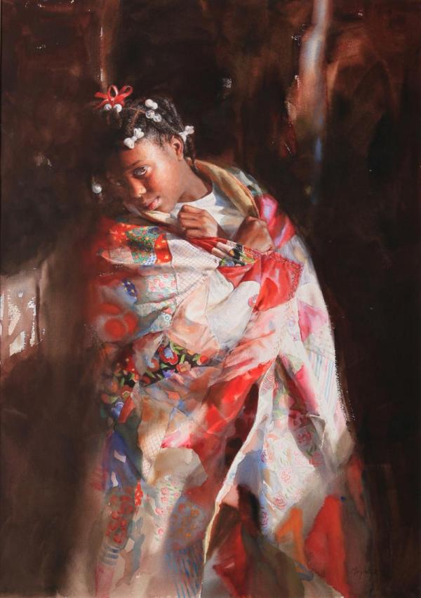
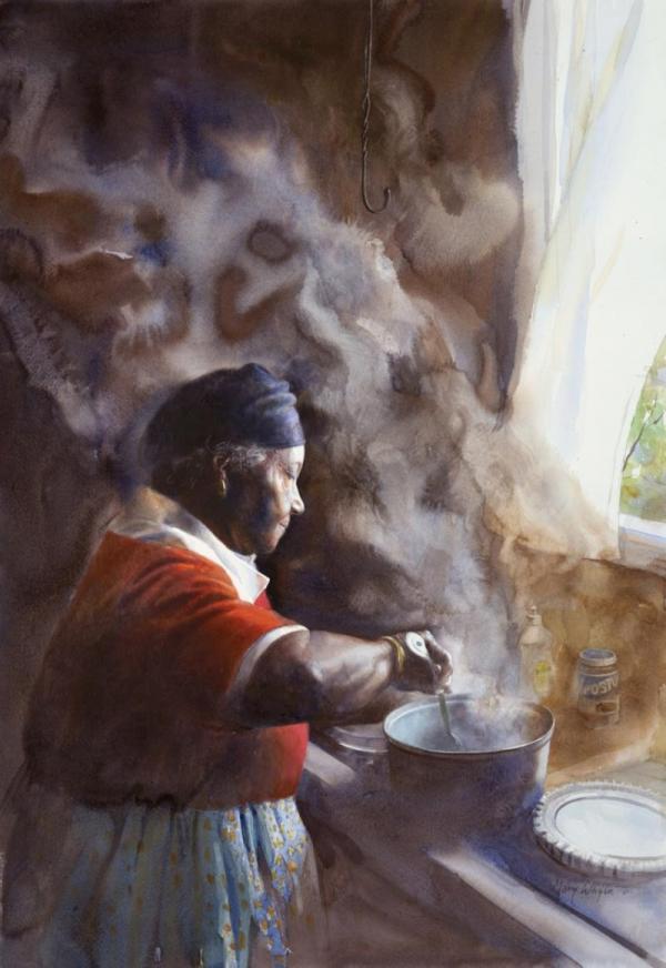
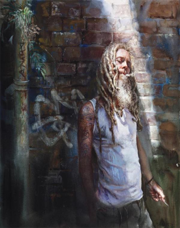
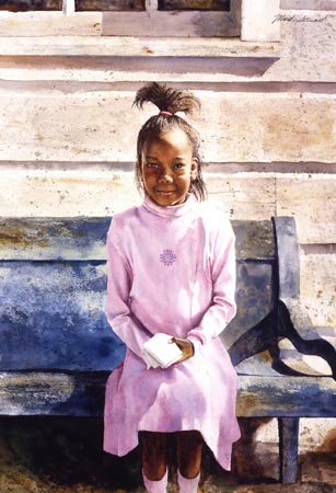
Mostly, though, she discouraged me. The picture on the front of the book was flowers in a vase. Pretty and inviting. Open the front cover and there’s a cute cat resting on top of basket of laundry. I noticed the texture of the fur, and figured I would learn how to do that someday. Then, a two-page spread showing a row of fourteen colorful mailboxes on posts, an unkempt field of flowers and weeds in the foreground and big blue-ish tree in the background, all blurry. Taken one item at a time, I could probably figure out how to draw, then paint, some of these component parts. But then, there was this man riding a bicycle, and an older gent with a farmer/trucker hat, and I felt his presence. This was more than my beginner’s mind could conceive of painting. What was Mary Whyte trying to teach me? The sections about materials, paints, papers, and a studio setup were within reach, but then, just a few pages later, a painting of a girl standing by a window, and I feel like she’s going to tell me her life story. Then, later, there’s Maria, a 95-year-old woman, singing a hymn from her rocking chair on her front porch with a fringed shawl waving in the breeze. Mary Whyte is trying to tell me something — watercolor is about telling stories, and the best stories are the ones about the people who live nearby. A woman at a local church making a quilt. Step-by-step instructions to capture a woman cooking fish in a frying pan. I want to know which yellow and blue I ought to use to mix green. She’s showing me magic.
Clearly, I needed another book. And I bought a bunch of them. And I practiced. And now it’s three decades later, and Mary no longer lives near me, she lives in South Carolina instead. Her pictures are still magical. And there are a lot more of them. And a lot more to her story, too.
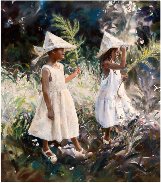
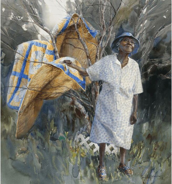
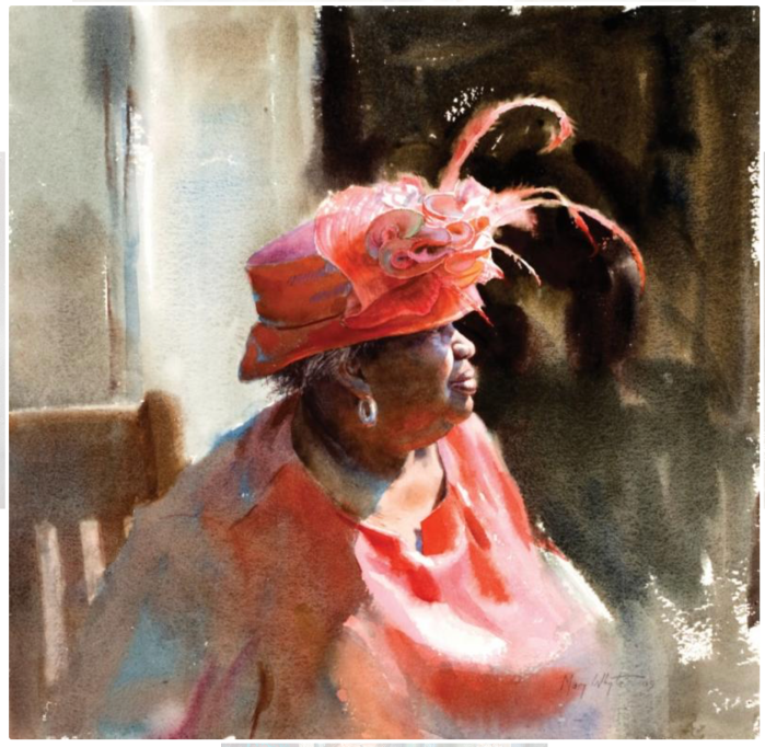
When I first encountered Mary Whyte, I think she was living, or recently lived, not far from me, up north. Watercolor for the Serious Beginner includes more than a few pictures she made of her new life in South Carolina, initially in and around Johns Island. This is low country. It is rural. Mary made friends at a local church and painted welcoming ladies who made quilts together, cooked, and wore fancy hats on special occasions. The pictures are well-collected in a book in a lovely book entitled Down Bohicket Road, and also, in the harder-to-get Alfreda’s World.
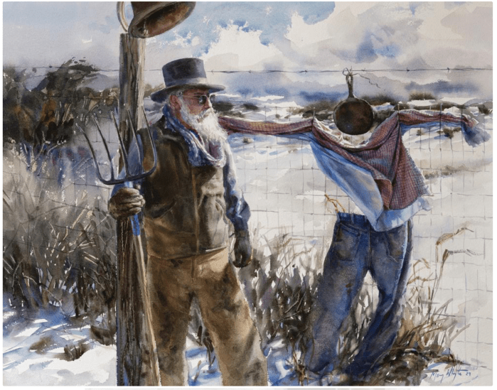
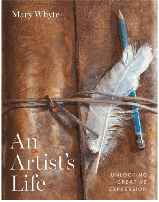
As Mary explains in her 2025 book (which I should have reviewed last year, not in 2026), An Artist’s Life: Unlocking Creative Expression, she explains her process and her growth as an artist. She began to paint people at work, working people in the south, folks with blue color jobs, farming for oysters, washing dishes, construction workers. You can find some of that work in another book, Working South, with more in Salt of the Earth. This then led to a much larger (and somewhat crazy) project, We the People. She found one veteran in each of the fifty states — yes, she traveled to every one of them, took photos, made sketches, and finished some of those watercolors back in her South Carolina studio. It was a resounding success, even featured on CBS Sunday Morning.
When I started reading An Artist’s Life, I began to appreciate just how much I had missed. There is a wonderful through-line here, and Mary explains herself well. This is a creative life with extraordinary output, in which the artist grows, causing my heart to beat faster. I open to page 130, and there’s a postal worker carrying a clunky package on her shoulder with bags of mail filling the shelf behind her. This is a woman with a job to do, hand on hip, looking to the light. Mary is telling her story, but there’s more to it than that — certainly more than some watercolor paint, water, a few brushes and a 27.75 x 40.25 sheet of paper. There is life here. As the author reminds us with periodic quotes throughout the new book, “We don’t paint a likeness of a person; we paint what it feels like to be that person.”
This is still inconceivable to me as an artist slow to learn. I look at each of these pictures and I see nothing but magic. I want to see technique. I want to study how Mary Whyte can use the same supplies that are sitting on my table, hold them in the same way I do, and create a life force.
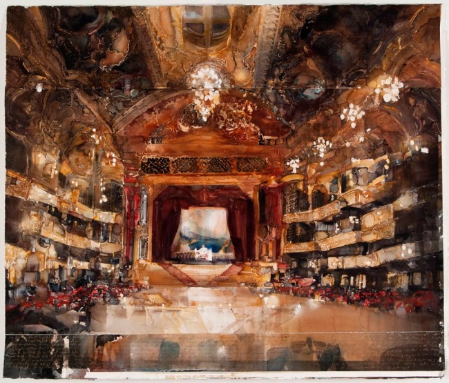
 Every once in a while, I’ll find an artist on the web whose work I truly admire. I recently stumbled upon a Texas watercolorist named Mark Stewart, and I thought you might enjoy seeing some of his work. Of course, there’s no reason why you should read any of what I have to say… just go directly to his