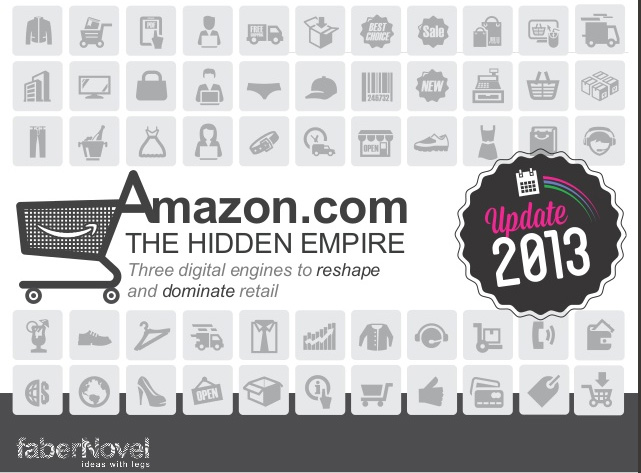
Amazon: Any Thing, Any Where, Any Time

Amazon-HiddenEmpireFaberNovel is a website filled with interesting, well, I’m not sure what to call these packages of visual information. They’re kinda sorta PowerPoint presentations, but they feel more like a new kind of business book.

Originally, I was going to tell you that there’s a good (updated 2013) story of how Amazon is taking over the world. The presentation, above, tells a compelling tale about how the e-commerce giant has grown, offering considerable detail on the business side, and lots of insight about Amazon’s likely future.

As I went through the 84 slides, I became curious about who was telling the story, and became interested in FaberNovel, the publisher who offers this material under a Creative Commons license. As I browsed, I found an All About Google FaberNovel, too. And another about Google, Facebook, HTML5, the list is both impressive and multi-lingual (that is, presentations are available in multiple languages).

The stories are well-told, simply illustrated, and rely upon diagrams and other simple PowerPoint graphic techniques (nobody will be impressed by the visuals, but the stories are good; Edward Tufte’s magic wand would greatly benefit this material).

I’d start with the Amazon story because it contains so many “oh, that’s why!” or “that’s how, that’s a really good idea” or “what an awesome story of business strategy.” moments. Some of it is likely to be familiar, but it’s unlikely that most people have connected the dots. Sure, 84 pages may seem like a lot, but it’s not more than a half-hour of your life, unless you’re a serious student of e-commerce business.

Interesting discovery.

The Art of Inge

Below, a picture of Inge Druckery with her reducing glass. Why a reducing glass, and not, say, a traditional magnifying glass? Because a reducing glass allows the user to step away from the visual work. By stepping away, the artist/designer can see the whole, and the relationship between the many pieces of a visual presentation.

Inge 1Inge Druckery is one of the world’s truly great teachers of type design, and, more generally, she has provided designers of all kinds with tremendous inspiration, especially in the combinations of typography and graphic design that so dominate our world, our screens, our print materials.

And now, Edward Tufte (one of her students) has executive produced a 37-minute film, available free, about Druckery’s life and work. The images are striking in their simple elegance, and there are plenty of them. You can watch the film by visiting Mr. Tufte’s site, or simply clicking on the video at the top of this article. This is a film to watch full-screen, in a quiet room free from distracting glare, without interruption, with a patience and a keen eye. Do so, and you will be rewarded with an experience very much akin to attending an extremely well-crafted art museum exhibition on an extremely interesting topic. Do not hurry. Do this when your time permits. The images and ideas will stay with your afterwards.

What sorts of things are presented? The extremely precise Roman alphabet, the letterforms that are so solidly architectural in their L, E, T, and V forms, and so much in motion in the S, so beautifully balanced as curves meet straight edges in the B and, especially, the tricky R form. Simple explanation, elegant presentation.

Fascinating.

Here’s a progression of the letter R, rendered by hand with a proper broad lettering brush, with each letterform progressing toward an ideal. Here, the most basic of old analog form presages a perfection now commonplace in digital typography. Commonplace, but not common. And in the common hand, perhaps there is greater perfection, more of the Lord’s hand and the human progress toward excellence, than digital allows.

R Progression

Edward Tufte Kills Two More Kittens

Last night, I was one of two keynote speakers for an innovation event. As a speaker, I’m supposed to be the teacher. Three people in the audience were fast asleep. I am their grateful student.

I spoke for over a half hour. I’m pretty sure we should pass a law, or perhaps, a constitutional amendment, that assures no speech will ever run longer than 20 minutes.

I structured my speech with over 100 clever little slides (I used Keynote, which is cooler than PowerPoint). Every visual cue was carefully tied to specific words in my written script. So I paid more attention to the script and the visuals than I did to the audience. Occasional ad-libs only made the speech longer.

The gentleman who preceded me, a college president, used Prezi. What a cool visual presentation! I remember almost nothing he said. (Too busy looking at the cool imagery.)

So here’s a digital insider take on speeches, the morning after. Just talk to the audience. Tell them what you know. Allow yourself one index card with three key points.

Anybody in the audience who want to see the charts, graphs, photos, etc., tell them to visit your website or blog. In that environment, they can study the visuals in their own time, not in a crowded auditorium. When they hear hear you talk about an important idea, they can visit your website for more information.

Which is to say: speeches are terrific for revving up the audience and introducing new ideas, but they are not very useful for detailed presentation of ideas. Websites are not a good way to rev up the audience and introduce new ideas–there is no personal touch, except, sometimes, with an extraordinary video–but for details and the day-by-day updates, they’re terrific.

I trust the guys in the back row slept well. Last night, they were the most powerful teachers in the room.

For more on Tufte/kittens:

Tufte Kitten Kill Count

Intro to Tufte:

The Visual Display of Quantitative Information

%d bloggers like this: