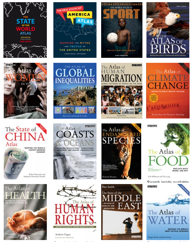
Sometimes, it’s difficult to understand an idea without seeing a picture. I suppose that’s one of the reasons why I like the idea–if not always the execution–of infographics. Give me a good map with abundant legend, little boxes with big information, arrows to guide me, and I’m more like to understand a complicated idea. The book publisher Dorling-Kindersley, also known DK, has developed a brilliant style based upon the visual display of encyclopedia information (you know their Eyewitness Travel Guides, for example).
Given sufficient free time, I’ll wonder about just about anything. One thing thing I’ve always wondered about is how mankind managed to populate every corner of the earth. Think about it–a small population in central east Africa with extremely limited resources, no meaningful transportation, little protection from the elements or from one another, somehow ended up in Siberia, South America, even Australia. How? Well, mostly, they walked. (Along the way, they struggled to invent the needle so that they could sew animal skins together, astonishing tech in their time).
You can learn a lot about the world by studying migration maps. For example, just about everybody knows that a large portion of the U.S.’s black population came from Africa. Now Africa’s a big place. Where did they come from, exactly? Yeah, well, I had no idea until I checked a map in People on the Move: An Atlas of Migration by Russell King. There were two main “collection points”–one was Luanda, still the largest city in Angola (many of those slaves were controlled by Portuguese interests, so they ended up either in Brazil or the U.S.). Slaves leaving from Accra and El Mina (or, Elmina) mostly traveled to Brazil, Virginia or Louisiana. Some African slaves ended up in Portugal, too. The British, French and Dutch colonial slaves more often traveled to the Caribbean Islands.And that’s just part of the story: lots of African slaves were sent along Arab trade routes and up into Turkey–a much earlier system of human trade based upon ancient tradition.
 So that’s one migration. There’s another 13.5 million people moving during the period 1815-1915. Those people are moving, mostly, from Europe to America. Lots from Ireland, England, Scandinavia, and later, Spain, Italy, and eastern Europe–the peopling of America.
Migration is still a robust human endeavor. The oil boom in the Persian Gulf has been a magnet for several million people (the population of the United Arab Emirates [capital city: Dubai] has increased from 180,000 in 1966 to 4.4 million four decades later, with most of the new people foreign nationals). Lots of movement in the USA, too, first from to the west, then from the south, then from the rust belt to the south. People migrate for marriage, careers, college studies, so many reasons. Never really thought much about it, but this book has been fascinating.
And it’s part of a series. All are published in the U.S. by the University of California Press, but they’re made by Myriad Editions and they’re available from other publishers in other languages in other parts of the world.
I first encountered the series through The Atlas of Global Inequalities by Ben Crow and Suresh K. Lodha. If you’re fascinated by headlines like “2% of adults possess more than 50% of all global wealth” and “50% of people possess only 1% of all global wealth,” this book is your next birthday present. The authors go very deep into graphing of statistical information, lavish in their use of shapes and colors to clarify confusing points, so this book requires, and rewards, quiet and attentive reading. The relationship between life expectancy and household income is striking–live long and prosper in New Zealand or Iceland, or live a few less years but live somewhat richer in the U.S.A, Norway, or Luxembourg. Life expectancy in Africa is 54 years, but in North America, the average is 79 years. Children born in central Africa are likely to live only half as long as children in western Europe.
There is, in fact, a wide range of topics covered in this series. I’ve been through these two, plus a more challenging topic, The Atlas of Human Rights, which tracks, mostly, violations of freedom.
 Of course, I want to browse every page of every one of these 100+ page mini-atlases. I suppose The Real State of America and The State of the World ought to be the next ones that occupy a quiet afternoon, but The Atlas of Water and The Atlas of Food are no less intriguing.
Closing out this article, here’s an spread from The State of the World Atlas:

Please Comment