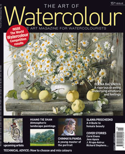
The Art of Waterolour Magazine: The Art Magazine for Watercolourists, Issue 15 is now available. Race to your Barnes & Noble bookstore to have a look; copies are always in limited supply.
Note the “u” in “watercolour” — this is an article about an extraordinary magazine published in Europe. If I happen to show up at a well-stocked Barnes & Noble store in the U.S., I might catch the 15th issue, but so far, my success rate has been inconsistent. Yes, $15 is a lot to pay for a magazine, and no, this magazine is not printed on special paper or especially thick (about 100 pages per issue). It’s just, well, a very good magazine about a subject that interests me. It was interesting to write that sentence because I am interested in lots of different things, but this is among the few magazines (in the world, I guess) that would win that kind of recognition. (I enjoy Pastel Journal, for example, but I would rate it only “good” in comparison with The Art of Watercolour’s “very good.” As a rule, The New Yorker is very good, but most weekly issues would probably score a “good-plus” if there was such a rating.
So what makes a magazine “very” good? Of course, it’s helpful to offer an abundance of good stories and wonderful illustrations that are specifically intended to delight a very distinct target audience, in this case, the thousands of artists who call themselves “watercolourists.” The magazine assumes a relatively high level of familiarity with the medium, the artists with a national reputation, and a high level of interest in the work of many different types of watercolour artists throughout the world.
Take, for example, the recent issue #14. It begins with a report on the very first World Watercolour Competition which drew nearly 2,000 participants and 82 nationalities. Turn the page and there’s a spread about the Narbonne 2014 Watercolour Biennial (the magazine’s home base is France, so that country gets more attention that others, which makes me feel very international when I have the magazine in my hands). I love finding out about U.S. watercolor events in a French magazine—a blurb about the IWS competition coming up in May (now past), for example. Letters that matter—questions about the leading watercolour paint brand (Winsor & Newton) and whether it has changed its formulation; how to sign a painting; the Munsell color system. Serious discussion, nicely presented, far more up market and smarter than the discussions in, for example, Watercolor Artist in the U.S.
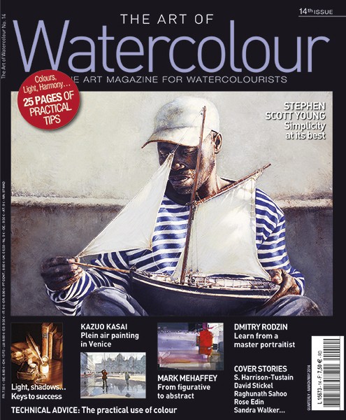
Here’s the cover of Issue 14 with a good painting by Stephen Scott Young on the cover.
And then, there are feature stories about artists. The warm-up is called Revelations, and several artists are featured, each with his or her own page. Turn the next page and there’s a fabulous spread, a watercolour of an old New York City apartment building complete with fireplaces and elaborate window wells, a six-page spread including an artist’s career timeline, lots of juicy images, and a demonstration, by American-born Sandra Walker. Next is a four-page spread celebrating Australian painter Ron Muller’s atmospheric landscapes, followed by the Japanese artist working en plein air in Venice. And then, the extraordinary portrait work of Stephen Scott Young, Hawaiian-born, with an extraordinarily eye and a sensitive, realistic way of painting the lives of dark-skinned people living in the Bahamas and Florida. The next profile—the profiles are worth the price of each issue—is a feature about an abstract artist named Mark Mehaffey, which includes some very useful guidance about the composition and building of a nontraditional painting. I have a friend who paints cityscapes and especially enjoys the challenge of reflections and store windows—and in this issue, there’s a feature about David Stickel, whose opening pages attest to his abilities with his nearly realistic image of the clear box Apple store on Fifth Avenue near Central Park.
I’m still going—and this is a typical issue. There’s an instructional piece by American art teacher about color harmonies, followed by another long instructional piece about getting colors right (not easy because some colors are native and some are affected by light and nearby objects, and by the way the eye perceives contrast). And then, another meaty instructional feature, again dealing with a fairly sophisticated topic in an elevated way: it’s all about shadows, light and reflection. The consideration of these tricky issues as a single idea makes the article work, but it goes further, allowing for a sidebar about color temperature and the nuances of semi-transparent surfaces. Finally, there’s yet another instructional piece on the very difficult challenges associated with all prima watercolour portraiture (that is, capturing the human face—here, a young child) created by dabbing color onto wet paper which is notoriously impossible to control without extreme practice and polished technique.
So there! I just wrote hundreds of words about a magazine. I don’t think I’ve done that before. In fact, I’m so taken with what I’ve been browsing for the past hour, I’m going to order some back issues, direct from Europe.
To close, something more from Stephen Scott Young, from his website.

