Balancing Technique and Inspiration

A new book about pastels from artist Jean Hirons.  If you buy it by clicking on the link (instead of buying from a more traditional source, the author earns more money for her self-published effort.)

A new book about pastels from artist Jean Hirons. If you buy it by clicking on the link (instead of buying from a more traditional source, the author earns more money for her self-published effort when you click on the book cover and make the purchase through Author House).

Ten or fifteen years ago, I decided to try my hand at pastels. That is, I bought a box of pastels, some paper, and started making bad art. At the time, there were two useful books available: Bill Creevy’s “The Pastel Book,” and Larry Blovits’s “Pastel for the Serious Beginner.” Both of these books were well-organized, and helpful, but neither provided the complete education that I wanted to pursue.

Over time, I bought more (and more) (and more) pastels, experimented with various types of paper, played with and decided that I pretty much hated fixative, bought a field easel, and started spending weekend afternoons making pastel paintings. To be honest, I didn’t much care whether each painting was worth showing to anybody; most of the paintings were wrapped in glassine (which does not smudge the painting) and placed, ever so carefully, into a box. Mostly, my concern has been learning how to pursue a creative process.

Along the way, I have bought just about every book about pastels that I could find. I’ve scoured the lists of the top publishers (then, North Light Books and Watson-Guptill, the latter now part of North Light). I’ve been inspired by the beautiful work and eye-opening creative thinking so elegantly presented by Elizabeth Mowry her two best books, “The Pastelist’s Year,” which looks at painting through the seasons) and “The Poetic Landscape,” which examines perception and the psychology of art through pastel painting. Both of Maggie Price’s books have proven very useful: “Painting with Pastels” and the more specialized “Painting Sunlight and Shadows with Pastels.” The out-of-print book that taught me ever so much was Doug Dawson’s “Capturing Light and Color with Pastel.” The more sophisticated, and modestly entitled, “Pastel Pointers” by Richard McKinley, is only part of a larger instructional program that can be pursued online or in the always-excellent Pastel Journal magazine.

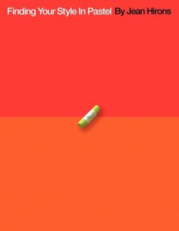
Still, I wish I was just starting out today, if only to do so under the guidance of Jean Hirons and her new (self-published) book, “Finding Your Style in Pastel.”

"Antietam Barns" by pastel artist Jean Hirons

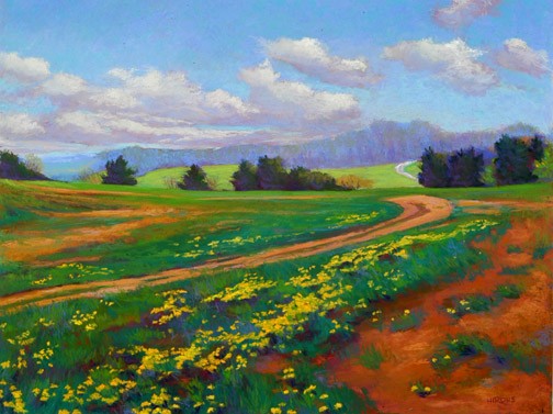
“Antietam Barns” by pastel artist Jean Hirons

From the very first image on the very first page, I sensed, I can probably do this. Immediately, my confidence level increased. A brief but substantive review of types (soft, hard) and brands (Sennelier, NuPastel) is followed by a rundown on the many surfaces (papers, mostly) now available (with running commentary on the advantages of each ground), and comments on strokes, blending, layering, and other techniques. I like the way Ms. Hirons keeps the story moving; she makes her points clearly and with the right illustrations, then moves on. (She is my kind of teacher!) There’s a lot of “show me what I need to know,” as with a quartet of small images to explain toning and underpainting (two methods of pre-painting a surface).

By page 63, she’s defining personal styles. This is, of course, what every artist wants to know. Basic techniques are fine, but how do I make my paintings my own? So begins one of the better explorations of composition, value, edges and color theory that I’ve seen in book form. As with the earlier chapters, the author does not linger; the pace remains solid, brisk and professional. Once again, two images from the artist’s online gallery help to make the point about the difference between the works of an artist who pursues a distinctive, personal style:

Carroll County Farm by Jean Hirons

Carroll County Farm by Jean Hirons

"Dandelion Spring" by Jean Hirons

“Dandelion Spring” by Jean Hirons

Same artist, different seasons, different color palettes, varying levels of edge sharpness, atmospheric color, amount of foreground detail, use of line and shape, mood, overall colorcast, color temperature, and so much more.

Hirons rarely insists upon one particular technique or approach. Instead, she runs through available options, the techniques required to achieve the desired effects, and well-chosen images to illustrate each point.

Along the way, she also addresses the questions that lurk in the back of every pastelist’s mind. To what extent do I paint the colors that I observe? How do shadows work: how dark, how much local color, how much should I shift the color temperature? How far should I go with my interpreted color? To what extent, and under which conditions, should I pursue abstraction?

Yes, there are some step-by-step demonstrations, but only a few (I’ve never been a big fan of books filled with step-by-step demos because I tend to lose interest unless I am actually painting at the same time as I am reading). Hirons uses them only in her final problem solving chapter (where they can do the most good).

In one of several appendices, the author recommends books about art, color, composition, landscapes, and, inevitably, pastels. Somehow, her list of recommended titles (which I just found as I was writing this last sentence) matches my list (at the top of this article) just about one-for-one. She adds “Pure Color,” a compendium of excellent pastel work by contemporary artists. To her list of materials sources, I would certainly add the venerable New York Central Art Supply near Greenwich Village.

Over time, self-published books can become hard-to-find (the author depletes the current stock and may or may not decide to continue to be a publisher–an especially challenging decision for an artist who is not, by trade, a publishing mogul). That’s why I always recommend that a self-published book be purchased immediately. In this case, the bound book–a 200-page, full color, very handsome paperback–costs just over $50, but the same book can be purchased for just $3.99 as an eBook. Despite my interest in all things digital, I would opt for the paperbound edition because I like surrounding myself with very good books. And this one fits, very nicely indeed, into that category.

The Wrong Picture

Black Children Play Outside The Ida B. Wells Homes, One Of Chicago's Oldest Housing Projects. There Are 1,652 Apartments Housing 5,920 Persons In 124 Buildings On The South Side, 05/1973

Black Children Play Outside The Ida B. Wells Homes, One Of Chicago’s Oldest Housing Projects. There Are 1,652 Apartments Housing 5,920 Persons In 124 Buildings On The South Side, 05/1973

John H. White was laid off this week. He is a photographer, or, more specifically, an out-of-work photojournalist.

He was replaced by an iPhone.

Black Muslim Women Dressed In White Applaud Elijah Muhammad During The Delivery Of His Annual Savior's Day Message In Chicago, 03/1974

Black Muslim Women Dressed In White Applaud Elijah Muhammad During The Delivery Of His Annual Savior’s Day Message In Chicago, 03/1974

As a much-deserved tribute to Mr. White, Chicago Magazine put together an online portfolio. The two images you see here are my favorite images; click on either one of them to see a portfolio of fifty superb examples of the extraordinary journalism that can be achieved by a skillful photojournalist.  The presentation of White’s work for the EPA is not as well-presented, but this site is also worth a visit.

Before moving on to the sharp point of this article, a word about the poetry of John H. White’s work. Consider the exquisite rhythm of both images, the special timing that allows the jump rope to wiggle and wave, the exquisite visual judgement Mr. White employed when filling his frame with Muslim women all in white. The sunny smile of the girl in orange and the placement of the innocent child in the background. This is photography at a high level; it is exceedingly difficult for most people, even serious amateur photographers with decades of experience, to achieve these results with the best possible equipment. (Imagine trying to achieve these results with an iPhone.)

The Chicago Sun-Times is one of America’s largest newspapers. Somehow, the management of the paper stumbled into what must have seemed like a wonderful idea at the time: teach the reporters to use an iPhone, and fire all of the photojournalists (including Mr. White). There’s been a lot of online chatter about the “difficult decision” and “the future,” but I have placed both phrases in quotation marks because both concepts are so insanely wrong-headed.

In today’s image-is-everything society, I suppose I could construct an equally compelling case for firing all of the writers on the staff of the paper, instead filling every page with photographs. Or, perhaps, establish some clever version of crowd sourcing, in which Chicago takes pictures of itself every day, and then, everyone posts captions (the most popular caption wins the top spot).

Certainly, there is a problem in the newspaper business: most papers have lost their business models, and much of their readership. And they have experienced a terrible cost-cutting decade (and more).

Firing the photojournalists may be a fine example of executive leadership discussions gone astray, but there is a larger problem here. The Chicago Sun-Times, and many other papers, aren’t sure how they should face the uncertain future. There are some answers, and, well, I sure hope the management of the Chicago Sun-Times (at one time, the largest of the 100 newspapers where my newspaper column appeared weekly), will consider them:

1. The Chicago Sun-Times is a very strong local brand. Even in a “newspaper town” like Chicago, the future of the “paper” is online.

2. Online, regardless of the platform, it’s all about multimedia: pictures, videos, infographics. Good writing matters, but anything longer than 1,000 words is too long for current use of the medium.

3. Investment in superior multimedia storytelling is the way to go. If the story makes use of video, some writing, lots of pictures, some audio, and powerful graphics, people respond.

4. If people respond, advertisers respond.

5. Focus on the best possible storytelling. Double down your previous investment in visual storytelling. Invest in more photojournalists, and teach them to become videographers if they’re willing and able. By all means, teach every writer how to shoot still images and video with their iPhones (or, go really crazy and invest in a high-quality pocketable digital camera for each of them–for far better results). Figure out how to get the crowd source journalism operating at its highest possible level, for that, too is the future.

I will steer clear of recommending that the executives who concocted this insane plan may find budget cuts in their own roles at the company, but only on the condition that they focus (a word that photographers often use, and for good reason) on the future of journalism so that the next budget cycle doesn’t require firing all of their writers.

Chi-Trib-Story

To read the Chicago Tribune story and watch the video, click on the image.

Make Good Art!

Wonderful, level-headed speech to graduating students at Philadelphia’s University of Arts by writer Neil Gaiman. You may not know his name, but you know his work: Coraline, comic books,graphic novels (Sandman series) short fiction, books, here an episode of Dr. Who, there a Simpsons episode, the list is long. At age 15, he made a list of what he wanted to do, then got started, and apparently, never stopped.  He discusses the sense of fraud that successful creative professionals experience; the nonsense about creative people wearing a tie and going to an office every morning, the importance of learning to say “no”. He reset his balance between writing for a living and spending a lot of time writing emails by responding to each one. He encourages creators to take chances and make mistakes; you acknowledges that the ultimate life saver is the secret that creative people share that others do not: we have the ability to make art.

It’s a terrific video, and well worth twenty minutes (or so) of your time.

His response to things going awry, as they will: “Make good art!”

The one thing that you have that nobody else has: “You!” (Your ideas, etc.)

The moment that you believe that you’re walking down the street naked, that you’re showing too much, that’s the moment . But you’ll have no idea. And what would be the fun in making something that you know is going to work? (Gee, he’s smart!)

The Belanger Factor

You know this photographer’s work very well. Here’s the setup for one of his iconic images:

belanger5


The photographer’s name is Peter Belanger. For years, he has been making his models look absolutely stunning. Millions of us have responded to his work, and will likely continue to do. He shoots with a Canon 5D Mark III, often with 24-70mm lens. You can buy this equipment in any professional camera store, or any good online photo store. But it would be difficult to imagine the average person shooting with the kind of precision that Belanger routinely brings to his work.

Intrigued? I was, just by seeing the elaborate setup that he uses to make pictures.

To learn more, visit The Verge.


Shadow Catcher

angelineThe woman in the photograph was a poor soul, without friends, the subject of ridicule among Seattle schoolchildren. She lived in a hovel. When the growing city of Seattle cleared its native population, she remained where she was, and the city grew up around her. Kick-is-om-lo was her name, but that was difficult to pronounce, so the local folk called her Princess Angeline. In 1896, Kick-is-om-lo was paid one dollar to pose for this picture–the equivalent of what she was able to earn in a whole week–by a struggling young photographer named Edward Curtis. To say this would be the first of many such images would be a substantial understatement.

Within a short time, Mr. Curtis’s photography practice was beginning to thrive, mostly in connection with his nature photographs on nearby mountains (he was, in his way, a predecessor of Ansel Adams, but that’s not why he became famous). Instead, he began to photograph the native people who lived within traveling distance of his home. His fledgling studio became a place to buy these extraordinary portraits, these scenes of natives who were both nearby and exotic, these souls who some perceived as savages and others as victims. They were dying. The number of natives was rapidly declining. Their languages were dying out. Soon, the people who spoke those languages would be gone, too.

Curtis found opportunities to photograph native people in their own habitats. He used a camera and an early sound recorder, and he began to build a collection. Some individuals trusted him, many did not. He was “deeply affected” by a Sun Dance that lasted five days. Neglecting his family, and in time, his Seattle photography business, he followed the path that many creative professionals have since followed. He began an obsessive effort to photograph, many, and then, most of the remaining native communities. His trips began to cover areas far from home. He would stay away for a year or more. In time, he found kindred spirits, including, for a long while, former U.S. President Teddy Roosevelt, who, like Curtis, enjoyed a deep appreciation of America’s natural and, to a somewhat lesser extent, native history. They became friends; Curtis made formal portraits of T.R.’s children and hung around the family estate at Sagamore Hill for a good while.

To continue, and to fulfill his creative vision, Curtis required far greater resources than his local photography business would ever provide. He required an investor at a time when the philanthropic community was just beginning to take shape. He planned to:

make a complete publication, showing pictures and including text of every phase of Indian life of all tribes yet in primitive condition, taking up the type, male and female, child and adult, their home structure, their environment, their handicraft, games, ceremonies, etc…

His bodacious plan: an expensive, limited edition twenty volume set containing “fifteen hundred full-page plates”

He managed to get himself into the office of J.P. Morgan, who reviewed the proposal ($15,000 per year for 5 years to cover all expenses), told wealthy banker that he had already spent over $25,000 on the project, that he was completely out of money.

Morgan said no. Actually, what Morgan said was, “I will be unable to help you.”

But Curtis didn’t take no for an answer. Instead, Curtis reached into his portfolio and began to cover Morgan’s desk with stunning photographs of natives, the likes of which Morgan had never seen: the salmon people of Puget Sound, the picture of Chief Joseph that Teddy (sorry… the President) loved so very much… And, bless his soul, Curtis left Morgan’s office with the commitment he needed.

But that’s just the start of an even wilder adventure that eventually finds Curtis producing one of the world’s first documentaries, and, eventually, finishing the whole project, destitute, so long after this intended deadline that, well, nobody cared about the books, Edward Curtis, or natives anymore (the Depression was an important reason why). The books, the original photographs, the obsessive life, all seemed to be for naught–until they were rediscovered decades later.

Now, you can see these pictures simply by clicking here. The link takes you to the Library of Congress collection of Edward Curtis’s work. Mr. Curtis overcame all sorts of stunning setbacks, but he did what he promised to do. And, thanks to him, we can at least begin to understand a culture that our people destroyed not so very long ago.

The one caution: nearly all of these images are very, very serious. Critics point out that Curtis’s vision of the stoic native presents an extremely limited, and so, distorted view, of the real lives of the people who made America.

The book is called Short Nights of the Shadow Catcher: The Epic Life and Immortal Photographs of Edward Curtis. It was written by Timothy Egan. The book was given to me as a gift. You should do the same for yourself, and for every creative soul in your life. It is a remarkable story, beautifully told, and of course, illustrated with the work of a master photographer.

One of the best ways to see the scope of Edward Curtis's work is to simply search his name on Google, and then look at the Images view. That's what I did to capture this sampling of his photographs.

One of the best ways to see the scope of Edward Curtis’s work is to simply search his name on Google, and then look at the Images view. That’s what I did to capture this sampling of his photographs.

Maintaining Clear Focus, Setting Priorities, Not Forgetting

Every once in a while, a tool becomes an indispensable part of everyday life. We’ve certainly experienced this phenomenon with smart phones, then tablets, email, web browsing, and for some, Facebook, Twitter, and other social networking activities. During the past few months, I have retrained myself so that all notes are dated, tagged, written and stored in Evernote. And every task, every to-do, every reminder is logged in a capable, well-designed software application called OmniFocus. I no longer make random lists (well, almost never). When something needs to get done, I enter it into OmniFocus.

What I like about Evernote, I like (or will soon like) about OmniFocus. I’m busy, I jot down a note or reminder on my iPhone, and I can fetch it, adding details or changes as I wish, on my iPad, or office iMac. (The one thing that I like even more about Evernote is that I can also access everything via any web browser, but that has not been much of an issue when I use OmniFocus because I always have a OmniFocus device with me).

OmniFocus-for-iPad-sync-new-iconsSo what’s the big deal about OmniFocus? There are dozens of to-do and reminder apps, with sync, available for far less than OmniFocus. Wunderlist is free, and so is Appigo’s To Do (available in Pro edition for $19.99 per year); Things for iPad costs $19.99, and OmniFocus costs twice as much.

For me, the key to OmniFocus and its value is a view of tasks by date. Sounds like every other task management software, like every GTD (“getting things done”) app, but that assessment is not quite right. Allow me to run through a task, an illustration of how OmniFocus is used to run much of my life.

OmniFocus entry screenAlthough it is possible to make a quick task entry, the more complete entry panel is more useful. After naming the task, I select a context from my own list that includes: Awaiting Response, Call, Create, First Contact, Followup, Just Do It, On Hold, Purchase, Research, Schedule, Visit Web Site, and Write. Then, I select a project, again from my own list that includes: Art, Books, Digital Insider, Home, Music, Software, Travel, Web Site, and various, specific work-related projects. I can stop there, deciding to add a flag to any high-priority tasks, but I prefer to add a due date to every task (start dates are also an option, but I don’t work that way). There’s a nice big note field, and I use hat to capture URLs, reminders of the most recent attempted contact (left phone message on 3.13.2013; sent reminder email on 10.12.2012). I can add a photograph, .jog, .gif, .png, or record an audio message.

That’s how I compose each task. Note that there are no priority levels (three stars for most important, two for moderate importance), and no color coding for each category (Music is red, Books are purple). I used these often when Appigo’s To Do was my management system. It looked pretty, but I seemed to spend more time futzing than actually, you know, getting things done.

So, that’s half of the story. The other half us a very reasonable view called Forecast. On the iPad, along the top, there are a series of boxes, each with a date and a number of due tasks. I click on Saturday, May 4 and I see the four tasks that are due on that day. I click on Monday, May 6 and I see the list of 13 tasks I have assigned to that date. Each task is clearly identified by its context (Digital Insider, Home, Music, etc.) In addition, down at the bottom of the screen, I see a quick view of my day’s calendar (among my few criticisms: I would be happier with even a hint of what meeting was represented by each of the schedule bars). Still, in a single screen view, I can assess my entire day and make way through all that I intend to get done. I’m surprised that so few task programs also offer this calendar feature; in fact, this was the single feature that initially drew me to OmniFocus.

This is a slightly truncated version of the iPad view. I have eliminated part of the (empty) middle section to draw your attention to the task list on the top and the calendar blocks on the bottom. In real life, few of my days go by with just two tasks. (Yours too, I suspect.)

This is a slightly truncated version of the iPad view. I have eliminated part of the (empty) middle section to draw your attention to the task list on the top and the calendar blocks on the bottom. In real life, few of my days go by with just two tasks. (Yours too, I suspect.)

Apple includes a geo-location feature in its Reminders app, and OmniFocus does the same. Of course, I can survey every task by looking at a context-based organization of the tasks on one screen, or a projects-based list on another. This is sometimes useful, but I much prefer the date view (I guess I think in terms of what I want to do today, not what I want to write for Digital Insider over the next few weeks). I find myself sending tasks from Safari, but some bookmark manipulation is required to do so (common among Apple and iOS products, a silly misstep on Apple’s part; I don’t know about the Android equivalent, but someone might comment on that question).

Apple (and other users) are accustomed to seeing tasks organized not only by time but by place. In OmniFocus, this feature is especially well integrated.

Apple (and other users) are accustomed to seeing tasks organized not only by time but by place. In OmniFocus, this feature is especially well integrated.

Another useful feature, which I ought to use more often, is called Review. It allows management of categories by group (for example, I can de-activate Art for a while), or place a group of items on hold. I prefer to work at the individual task level, but I probably could save some time and operate even more efficiently by using Review.

On the iPhone, I get just about everything that’s available on the iPad version. In fact, the day’s schedule does list specific events, a feature not available on iPad (yet?). How about the desktop version? Well, it’s available, but the current iOS versions are so good, OmniGroup is redesigning the desktop version to match the feature set. Apparently, the Beta testing is going quite well; from time to time, the publisher offers an update on the company’s blog. The new release will be tied to a fresh syncing approach called OmniPresence, also described in the blog.

With all of this positivity, I supposed that you should know that OmniGroup is a leading developer of Mac and iOS products, but these products are not available for Windows or Android. That’s too bad, and, I suppose the company’s executives keep wondering whether to continue to excel in the Apple world, or whether to expand so that their good work can be appreciated by users of other systems. In fact, this is the second Omni product I have written about in this blog (OmniGraffle was the first; it’s a diagramming program that I use all of the time), and I’m anxious to write about another one, OmniOutliner, another product being redesigned for desktop because the mobile version has been so warmly received.

Would I change anything about this program? Well, just a few things. First, I think I would offer flags in at least three colors, just to add a bit of additional “hey this is pretty important” highlighting (priority levels would only confuse an elegantly simple approach, so I would leave that alone). And, I wish I could see the names of my appointments on the iPad as I can on the iPhone. A means of web access would be nice, but it’s hardly essential.

Overall, based upon daily use for months, I wholeheartedly recommend OmniFocus to people who (a) tend to be very busy, and tend to manage many of their own tasks; (b) believe that good organization and clear task lists make it possible to get things done more efficiently and effectively (if you’re not a believer, there’s no point in any of this), and (c) require a more professionally-oriented system than most products in App Store provide. If you’re just working out shopping lists, OmniFocus can do the job, but so can a lot of other software. If you’re attempting to manage a business life, or a busy personal life, OmniFocus is probably a wise choice.

On Other People’s Bookshelves

During the past few months, a clever oblong book entitled My Ideal Bookshelf has been widely covered in the media. Each two-page spread contains a brief essay about books and reading by a cultural somebody, and a painting of that person’s favorite books arranged as they might appear arranged on a shelf (in fact, not one of the painted arrangements includes an actual bookshelf).

Browsing the groupings of favorite books, I did what I always do. I took some notes, and made a list of books I would like to read someday.

I have wandered through a vast number of books about food and cooking, but so far, I have not taken on Larousse Gastronomique. So, thank you to chef and cookbook author Hugh Acheson for that reminder, and to chef Thomas Keller for suggesting the same book.

From author Junot Díaz, a recommendation for Divided Planet: The Ecology of Rich and Poor.

apatow_bookshelf
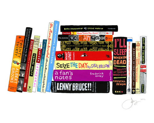
Judd Apatow, famous for his comedy movies, surprised me with James Agee’s A Death in the Family, and reminded me of a popular book about comedians that I wanted to read, but never did: The Last Laugh.

I was happy to see Dave Eggers highlight Edward P. Jones’s The Known World, a story about American slavery that I finished this winter, and now look forward to reading Denis Johnson’s book, Jesus’ Son which is “short, funny and impossibly lyrical…a book nobody doesn’t like.”

It was fun to see some of my all-time favorites, especially the obscure ones, on other people’s shelves: Chuck Klosterman likes Four Arguments for the Elimination of Television and Rudy Rucker’s The Fourth Dimension, and designer David Kelley likes The Care and Feeding of Ideas by Adams and the compendium, An Incomplete Education, and I do, too.

franco_bookshelf
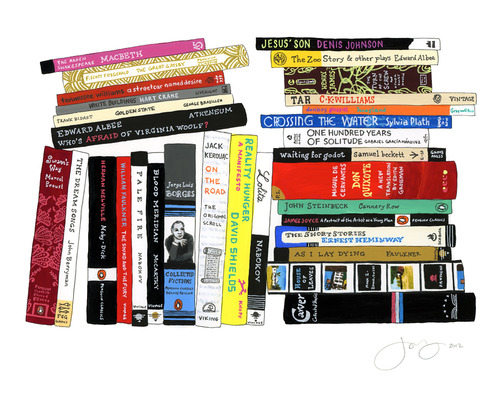
James Franco wins for the most cluttered bookshelf, also the one with the most books. From his stacks, I think I will pick up another set of Raymond Carver stories, and the original scroll version of Kerouac’s On The Road. I suppose I should read Melville’s Moby Dick, which I have avoided so far for no good reason. Ditto for writer Philip Gourevitch’s suggested A Good Man Is Hard to Find by Flannery O’Connor and Dostoevsky’s The Idiot.

I am among the many who believes Professor Lawrence Lessig to be brilliant, so I was anxious to explore his bookshelf. Mostly, it was the scholarly law stuff that appealed to me, but it was encouraging to see Neal Stephenson’s Snow Crash sitting just below The Federalist Papers. 

Writer / designer / photographer Ben Schott included Dylan Thomas’s Under Milk Wood, but I think I will listen to Richard Burton on the BBC rather than reading it in book form. Patti Smith reminded me that I have not gotten my copy of Allen Ginsberg’s Collected Poems, 1947-1980. Editor Lorin Stein’s list includes Chuck Amuck by Warner Brothers animation director Chuck Jones, which I know I will enjoy.

It was interesting to see one of my architectural favorites, A Pattern Language, on chef Alice Waters’s list, and I suspect we both found it by browsing the same source, years ago, The Whole Earth Catalog. Pretty much, I want to read her entire bookshelf, from M.F.K. Fisher’s Consider the Oyster to Maria Montessori’s The Secret of Childhood.

rosanne_cash_bookshelf

Rosanne Cash’s mix of E.B. White, Mallory and The War of Art (another of my favorites, it’s way over on the left), and Tennyson and Solzhenitsyn was among the most intriguing collections.

Finally: good for William Wegman for including not only two Hardy Boys novels, but also bits of the World Book encyclopedia, The Golden Book Encyclopedia, and Girl Scout Badges and Signs.

I was very pleased, and felt very smart, when I saw so many of my personal favorites on other people’s shelves. And, I felt woefully illiterate when I realized just how many of the books–sometimes, whole bookshelves–with both authors and titles that were completely unfamiliar to me.

(So many books. So little time.)

Great App for Ideas; No iPad Version Yet

Although it currently lacks an iPad version, there’s a wonderful software application called Curio 8 that offers a remarkable combination of fully integrated features related to the world of ideas. I discovered it recently, and I’m just beginning to understand how useful Curio 8 can be.

Basically, Curio 8 combines these functions in a single package:

  • Note taking
  • Brainstorming
  • Mind mapping
  • Task management
  • Presentation


It’s a little bit OmniGraffle, a little bit Evernote, with some of the functions of Keynote, but it’s also a drawing program that’s also useful for presentations. Although it’s awkward to describe Curio 8 in terms of other software applications, this particular application more than holds its own in each of these categories (and more).

As in Keynote (Apple’s answer to Microsoft’s PowerPoint, very popular on iPads), you begin by choosing an “Idea Space” (in Keynote lingo, a “theme”). You can then drag documents (PDFs, RTF word processing files, image files; also, web links) into the Curio 8‘s Organizer, and assign properties to each of these items. For example: notes, metadata, color, style, size, color. In addition, as you would with Things or any of the GTD apps (“Getting Things Done,” a fancy to-do list), you can assign filters (“hot”,”under peer review,” etc.) You can also assign the name of an Evernote Notebook or an Evernote Tag because there is deep integration between Curio 8 and Evernote.

That’s only the beginning. Once the Curio 8 “project” is established, you can add any of these and more:

  • Basic shape, styled shape, stencil (all similar to OmniGraffle)
  • A list, such as a to-do list (complete with iCal syncing) or a bulleted list
  • A mind map (similar to XMind or any number of other mapping apps)
  • A table
  • An index card (similar to Corkulus)
  • An screen snapshot (similar to Grab)
  • An audio or video recording

Curio-ScreenThese audio and video recordings must be made live–there’s a built-in recorder. In this version, Curio 8 does not support, say, .mov files, but you can paste the link to a YouTube or Vimeo file (requiring Curio 8 to be used with an internet connection in order to see these files).

But wait! There’s more!! The next set of features allows various sorts of sketching, drawing and painting with a variety of pens and brushes.

You can export the Curio 8 project as a .tiff, .jpeg, .png, .PDF, .html, and for selected items, you can export, for example, a .csv file from a table.

Assets used in one Curio 8 project can be easily accessed for use in another (gee, I wish this was a common feature in Pages and Keynote).

In addition, there’s a bit of scripting that will recall, for example, FileMaker. You can assign an action to a specific asset within a project. Click on a shape and Curio 8 will automatically set up a new email message, or open a URL, or open a specific file.

Curio 8 is the work of a very creative guy named George who lives and works in North Carolina. His company is called Zengobi, and so, you can find out more about Curio 8 by visiting http://www.zengobi.com. In case you’re curious, Zen is, of course, a Japanese sect of Mahayana Buddhism “that aims at enlightenment by direct intuition through meditation” and Goby is a small fish that swims in the shallow waters near North Carolina.

Often, George reports to his users via his blog. On March 13, he boasted about the addition of “the #1 requested mind mapping feature: mind map relationship lines.” On March 4, he explained the difference between a Concept Map and a Mind Map (the latter allows only one parent diagram per child). Lots of detail, all very useful and all wonderfully focused on the customer’s needs.

ScrivenerThis is the joy of working with a small software company: the product is terrific, and the company is highly responsive to customer needs. The same can be said about Literature & Latte, makers of the equally useful Scrivener word processor for authors, academics, screenwriters and playwrights.

The frustration, both for the company and for the user, is the amount of time required to build applications. In both situations, users have been patiently waiting for an essential tool: the tablet version of the software. Both of these programs are feature-rich. They have set a very high standard and they now serve a very specific niche customer base that expects an extraordinary feature set and a supremely reliable product.Typically, a small company is doing all it can to manage a Mac version (Literature & Latte recently released its first Windows version, but Zengobi has not). Add an app, and not just an iPad app, but a fully functional Android app as well, and the resource tug becomes uncomfortable.

And so, Curio 8 users do precisely what Scrivener users have learned to do. Be happy with the Mac-based product and its evolving feature set, and wait, patiently, for the inevitable release of the iPad app. In both cases, it’s coming soon. Even larger companies must take their time with app development–learning a great deal from every iteration. I’ve become a big fan of the OmniGroup products, happily using OmniFocus to manage my daily affairs, but only on the iPad and iPhone. Turns out, those apps are now so good that the older Mac app is so far behind that I don’t really understand how to use it. So what is OmniGroup doing? Redeveloping the Mac app so that it works the same way as their iOS apps.

We’re all learning a lot from this new wave of software application development. And, mostly, we’re discovering that this is all a very new way of thinking. Getting it right takes time.

Masterful Visualizing

In my last post, I recommended a book entitled The Writer’s Journey: Mythic Structure for Writers by Christopher Vogler. As a companion, I recommend another book from the same publisher, Michael Weise Productions. This one is entitled Cinematic Storytelling: The 100 Most Powerful Film Conventions Every Filmmaker Must Know. It’s written by Jennifer van Sijll. Like The Writer’s Journey, Cinematic Storytelling is useful to the one telling the story, and to the reader or audience member on the receiving end. Why does this book matter? Because we’re rapidly developing into a world of visual storytellers–smartphones and digital cameras in hand–and it would be wonderful if everyone could do their job just that much better.

CInematicStory_website_largeBasically, this book is an encyclopedia of visual storytelling techniques, but it’s fun to browse because every idea is illustrated by frames from a well-known or significant film–and each sequence is presented with the relevant bit of the screenplay along with perceptive commentary from the author.

Some are easily understood by the audience, and as a result, they must be used judiciously by the filmmaker or storyteller: the slow-motion sequence in Martin Scorsese’s Raging Bull; the freeze frame that ends Butch Cassidy and the Sundance Kid; the fast-motion sequence in the French film, Amelie; the famous flashback in the Billy Wilder film, Sunset Boulevard; the visual match cut that transforms a bone into a spaceship in 2001: A Space Odyssey; the long dissolve between young Rose and Old Rose in Titanic.

A specialty lens was used by Orson Welles in Citizen Kane–perhaps the movie most often used as an example to illustrate a variety of techniques. Sometimes, a telephoto is the appropriate storytelling choice, and sometimes, it’s the wide angle. These are not random, on-the-fly choices; instead, they are carefully considered during the storyboard phases of film development.

In this entry featuring The Graduate, the author explains the use of a "rack-focus"--here, shifting the focal point from one character to another. The author explains, "Unseen by Elaine, who is still facing Ben, Mrs. Robinson stands in the doorway. Mrs. Robinson is out-of-focus and ghost-like. When Elaine spins around, Mrs. Robinson is pulled into focus, and Elaine is thrown out of focus (Image 4). Every line in Mrs. Robinson's defeated face now shows. After a beat, Mrs. Robinson disappears from the door. When Elaine turns back to Ben, her face remains momentarily blurred, externalizing her confusion. At the moment of recognition, her face is pulled back into focus.

In this entry featuring The Graduate, the author explains the use of a “rack-focus”–here, shifting the focal point from one character to another. The author explains, “Unseen by Elaine, who is still facing Ben, Mrs. Robinson stands in the doorway. Mrs. Robinson is out-of-focus and ghost-like. When Elaine spins around, Mrs. Robinson is pulled into focus, and Elaine is thrown out of focus (Image 4). Every line in Mrs. Robinson’s defeated face now shows. After a beat, Mrs. Robinson disappears from the door. When Elaine turns back to Ben, her face remains momentarily blurred, externalizing her confusion. At the moment of recognition, her face is pulled back into focus.

Selecting a particular point-of-view (POV) can be a critically important aspect of storytelling, as with the below-the-swimmer underwater sequence just before the first swimmer is killed by a shark in JAWS. For which scenes is a low-angle shot most appropriate (character POV for E.T. would be one example), or for which would a high-angle shot be the better creative choice? When does it make sense to use a tracking shot (the camera is mounted on a tripod that glides along tracks; some low-budget achieve similar results by employing a wheelchair)?

Lighting is another variable. In American Beauty, there’s a scene illuminated by candlelight. In E.T., the search is conducted by flashlights and car headlights that illuminate an otherwise dark nighttime landscape.

In Barton Fink, individual shots of props (hotel stationery, an old typewriter) add visual context. Wardrobe is another defining option. So, too, is the use of location as a theme, a concept so masterfully used by director David Lynch in the vaguely creepy Blue Velvet.

It’s not always about what is seen. Sometimes, the scene contains less information, and the story or theme is carried by music or sound effects. Back to Barton Fink for the eerie sense of surreal sound and its ability to paint a picture of each character’s inner world.

Masterful Storytelling

WritersJourney3rddropWe live in remarkable times. Stories are told in every part of the world, and shared with millions of people. Once, this was the domain of the rich and powerful. Today, anybody can tell a story, and share the majesty of their ideas.

Of course, some stories are better than others. There is an art and a craft to all of this, a discipline studied in college programs and in private instruction taught by masters.

One such master is a Hollywood story consultant named Christopher Vogler. Since 1998, Vogler has been the industry expert on a particular, popular type of storytelling and character development. He explains it all in a wonderful book entitled The Writer’s Journey: Mythic Structure for Writers,  now published in its third edition by Michael Weise Productions.

No doubt, you are familiar with the structure of the mythical hero’s journey. You’ve seen it in so many movies. The hero of the story does not begin as a hero. Instead, he or she (more often, he) is an ordinary guy doing ordinary things every day. Then, something happens, and suddenly, he is thrust into an uncomfortable role, reluctant to proceed in anything resembling a heroic journey. Inevitably, the wizened old mentor or the playful talking dog shows up, and the ordinary guy begins to understand that he has no choice, that he must pursue the journey whether or not he wants to do so.

It’s Star WarsThe Wizard of Oz, Sister Act, Big, Raiders of the Lost Ark… you know the routine, but it’s still a story we love to experience, a story we love to tell. It’s the human experience, each time presented anew.

We’re on a mission from God” — Dan Ackroyd and John Landis, screenplay, Blues Brothers

So what’s so special about this book? Well, Vogler has a tidy way of breaking down each of the steps along the journey. For example, after leaving the ordinary world; hearing the call to adventure; refusing the call; meeting with the mentor; encountering tests, enemies and allies; and approaching an innermost cave, the hero is inevitably faced with an ordeal that must be overcome in order to move ahead with the journey. Joseph Campbell, whose book, Hero with A Thousand Faces, covers much of the same territory from a mythological analysis perspective, also arrives, at this point in the journey, at the greatest challenge and the fiercest opponent. So here’s the secret of the ordeal:

Heroes must die so they can be reborn.

To be clear, “the dramatic movement that audiences enjoy more than any other is death and rebirth. In some way, in every story, heroes face death or something like it: their greatest fears, the failure of an enterprise, the end of a relationship, the death of an old personality. Most of the time, they magically survive this death and are literally or symbolically reborn to reap the consequences of having cheated death. They have passed the main test of being a hero.”

Vogler goes on to explain that heroes “don’t just visit death and come home. They return changed, transformed.” So, the ordeal serves as a central core to the story, the place where the variety of story threads begin to tie together in a meaningful way. BUT–the crisis is not the climax of the story. That’s a completely different concept, a part of the story that arrives much later on (near the end, in fact.)

One reason why we love to watch the hero’s journey time and again is because every story is unique. Vogler explains how and why this may be true. Most often, the crisis occurs at the story’s mid-point, which Vogler describes as a tent pole–if it’s too far to one side, the tent sags / the audience’s interest wanes. (He reminds us that our word “crisis” comes from a Greek word meaning “to separate.” Vogler looks at the question of ordeal from many different perspectives, each one a driver that we’ve all experienced in the movies or in good fiction: a crisis of the heart, standing up to a parent, witnessing the death of a loved one, going crazy with emotion, and the list goes on.

If you’re sensing that The Writer’s Journey might be a useful tool for both constructing and de-construcing stories, you’re beginning to understand the value of Volger’s accomplishment. For the writer attempting to tell a story in a way that will ring true for the reader or the audience, this would seem to be an essential tool. For the reader, or the movie fan who wants to better understand the art and craft of storytelling, the deep secrets of the creative team, this book exposes the magic for the trickery that it is, then waves its cape to reveal far deeper magic within. For the English teacher, or professor, in search of a far better way to connect with students who ought to read or write with greater proficiency, here’s the elixir.

Of course, that’s only part of the story: the writing. Next up, from the same publisher: how to tell the visual story to ignite the audience’s imagination.